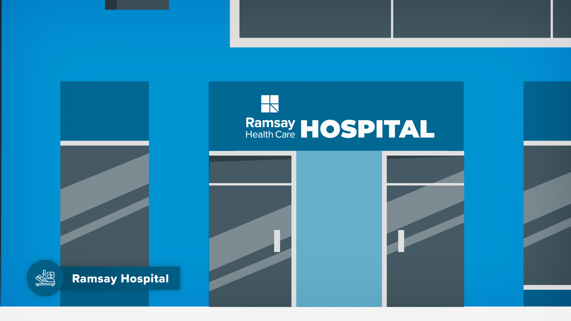
Ramsay Health Care | Future Customer Journey
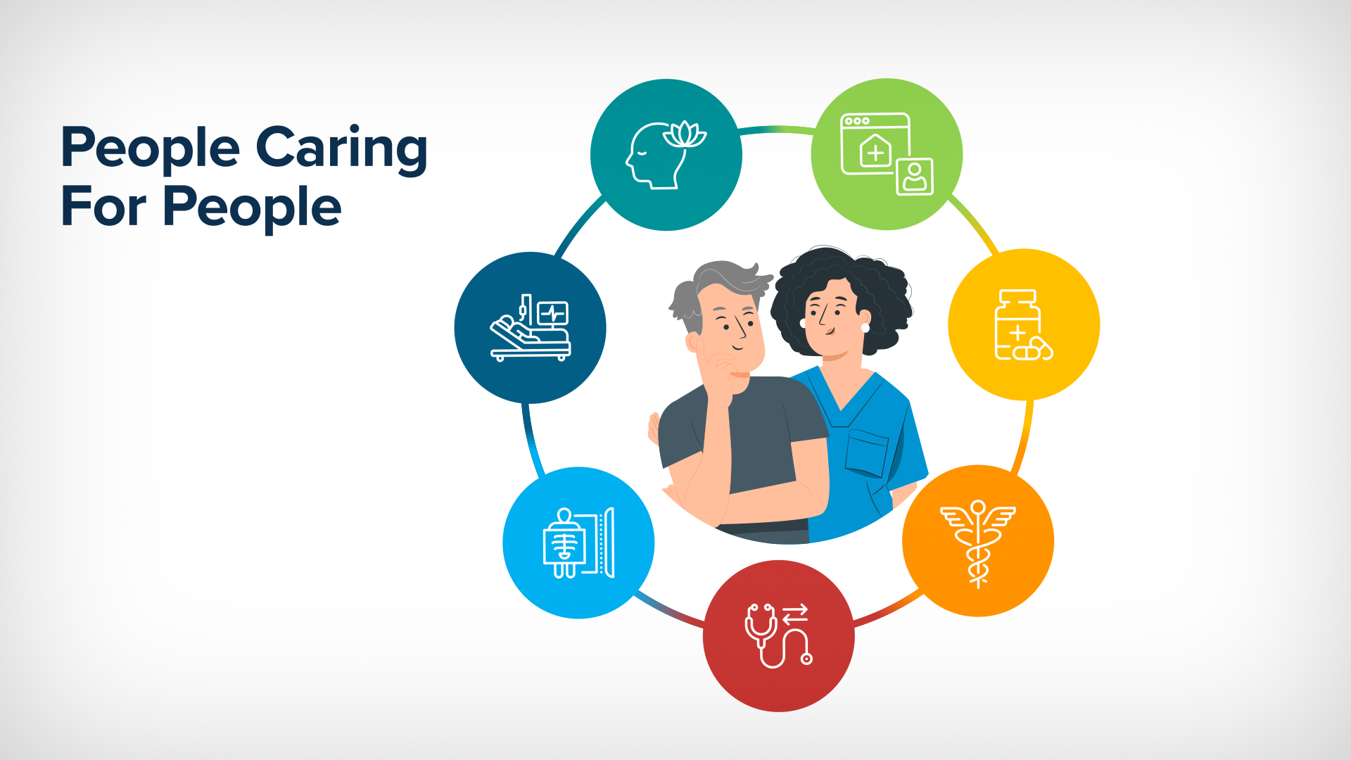
Ramsay Health Care, a leading multinational health care provider, brought me onboard directly to create for them a 4 minute internal animated explainer animation from visual concept to delivery that outlined their vision of a future customer’s journey as a concept in their newly proposed AI-led digital ecosystem. Even in this new world of AI driven digital first solutions, Ramsay succeeds in bringing it back to ‘people caring for people’.
-
Client: Ramsay Health Care
Project: Future Customer Journey - Internal Explainer Animation
Date: Delivered April 2024
My Role: Visual Concept to Delivery:
[Asset Management / Style Development / Storyboard Concept & Design / Asset Creation / Animation / Music Mix & SFX]Deliverables:
4 min Internal Explainer Animation (16:9, .mp4)
64 Storyboard Designs (16:9, .png)
Sub-brand icon set (.ai, .png)
Sales Navigator Asset (.ae template, .mov)
-
The greatest challenge was the time frame, I was tasked with creating an explainer animation end to end, from concept to design to animation to final delivery, given simply a scripted voice over and a 1 page pdf diagram of the Future Customer Journey concept stages, in 2 weeks.
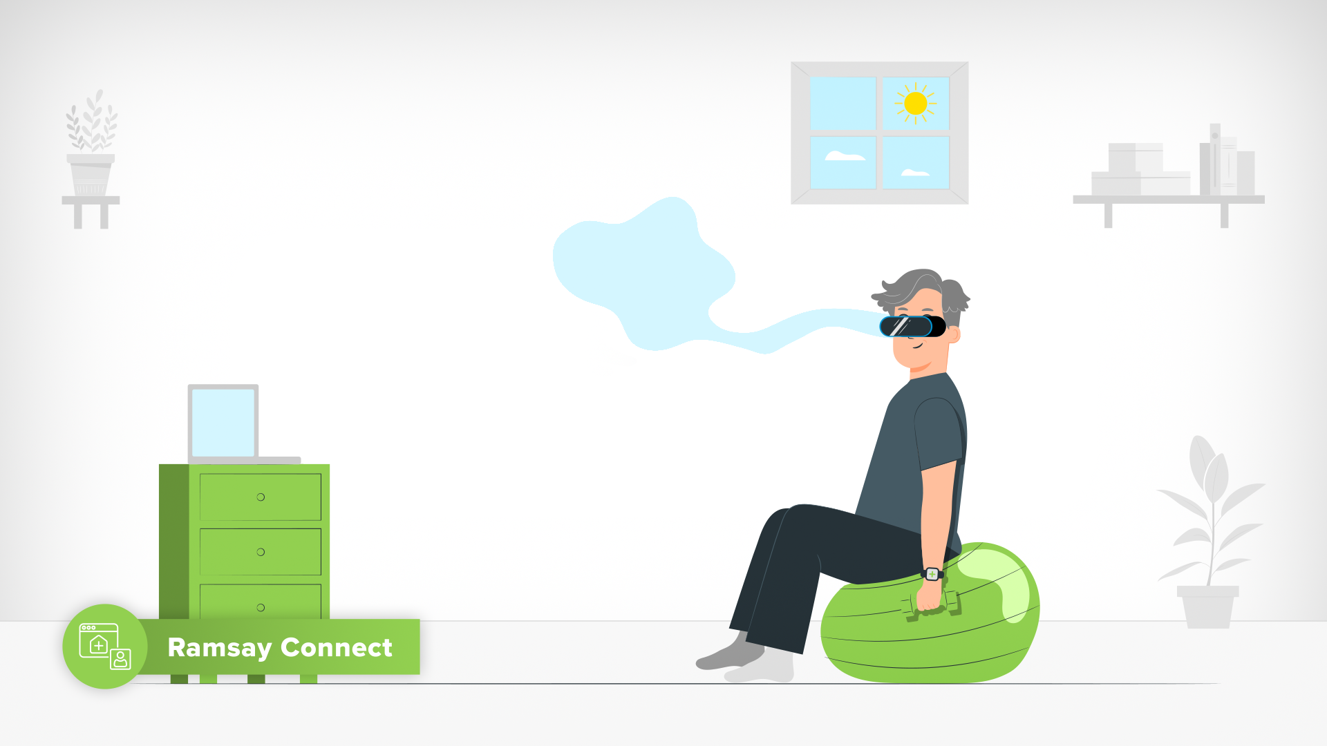
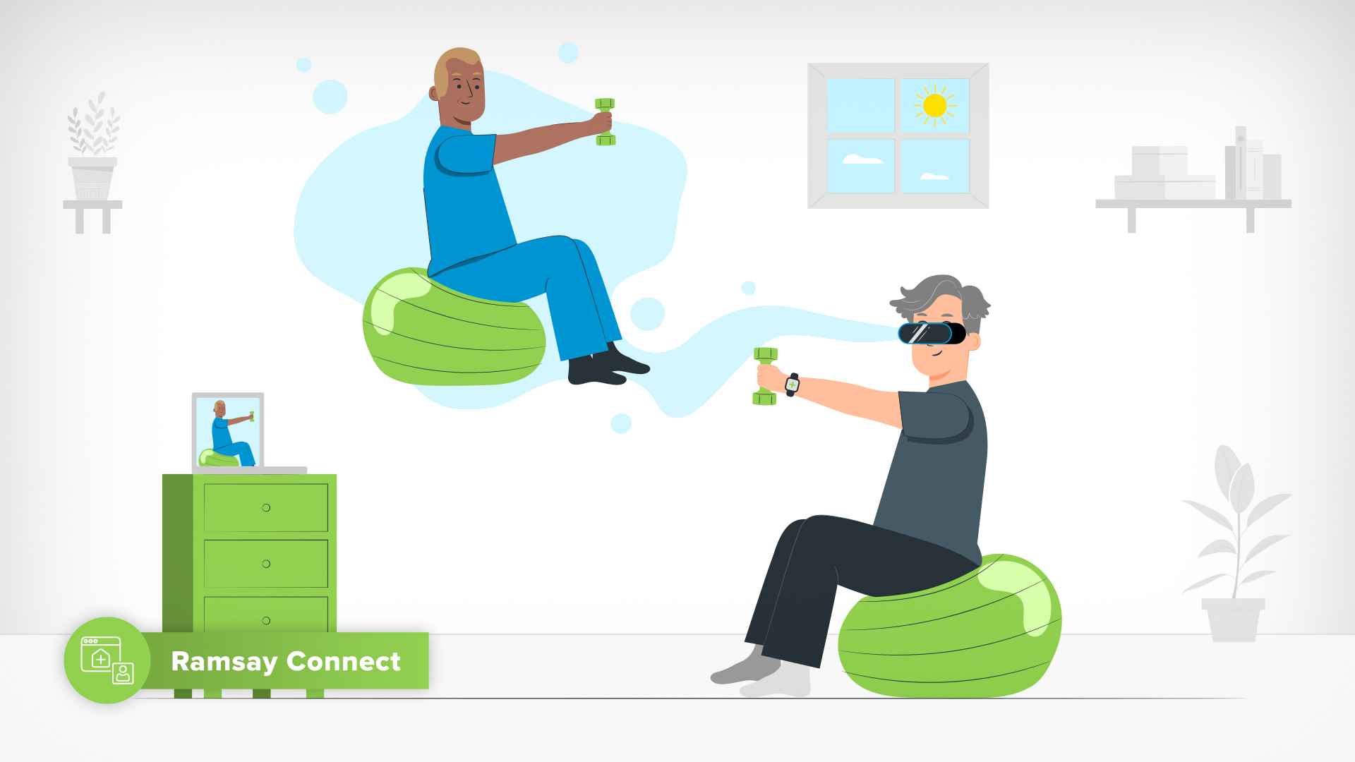
Being a character led animation with a quick turnaround, it was important to identify the minimal extent to which characters needed to animate and hence be broken down. In this case, less was indeed more when it came to using this limitation to my advantage.
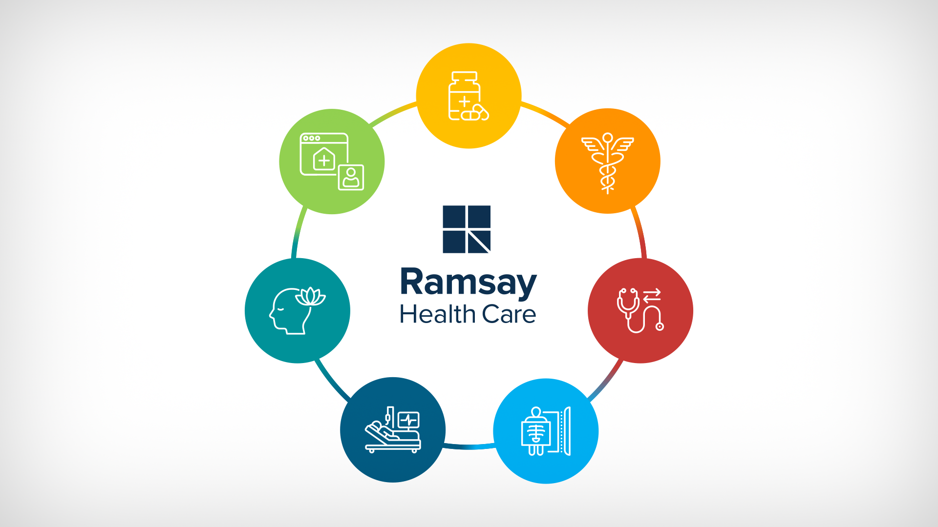
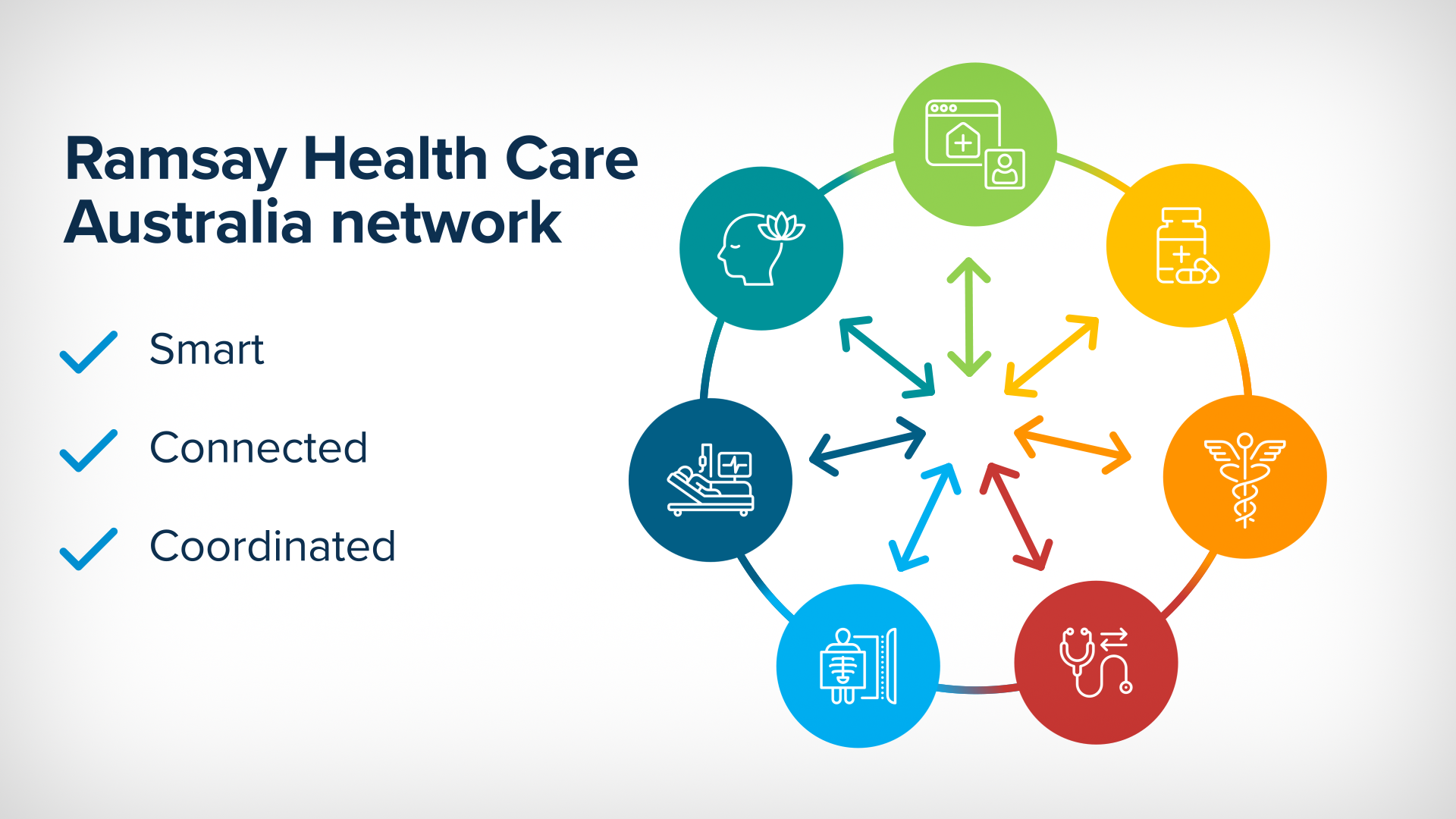
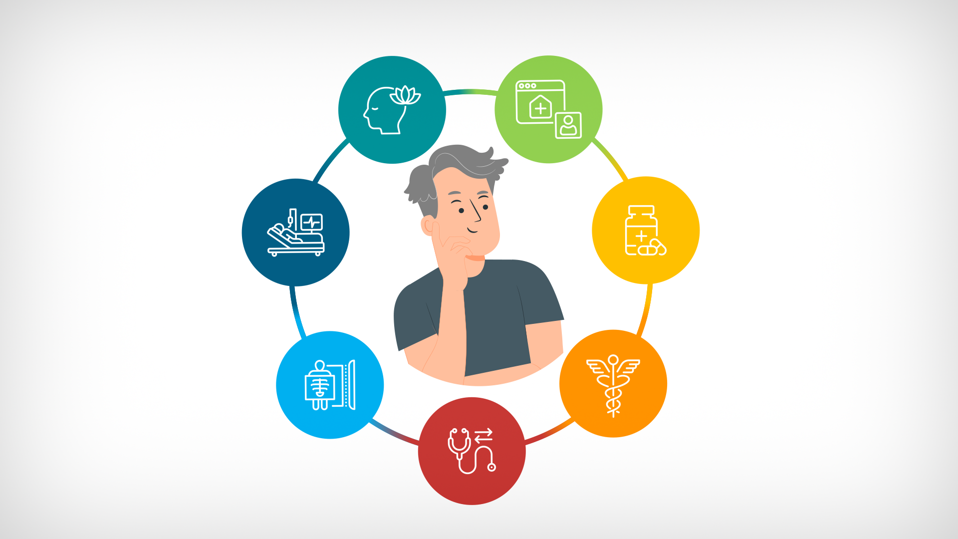
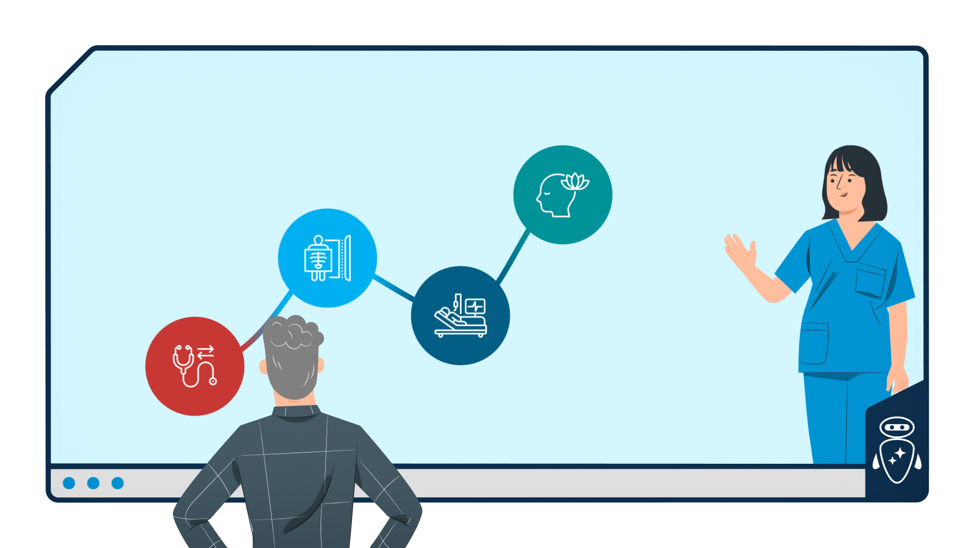
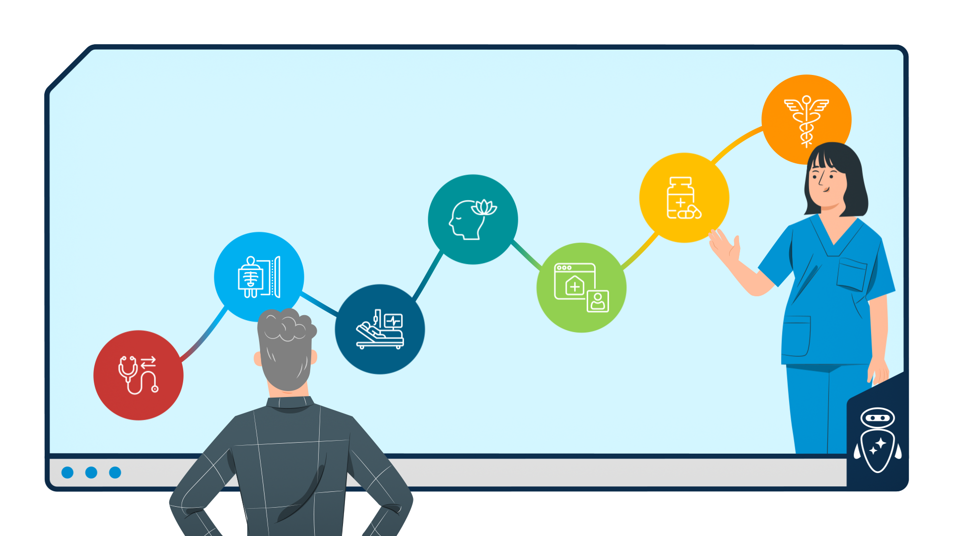
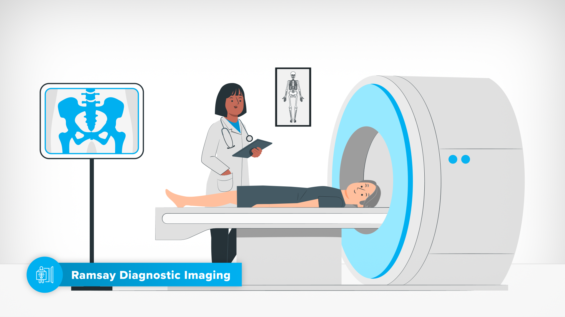
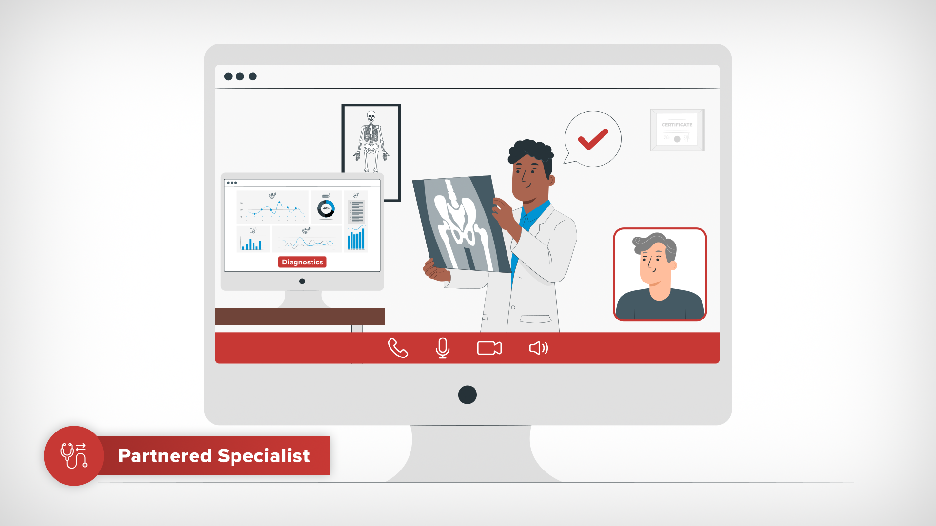
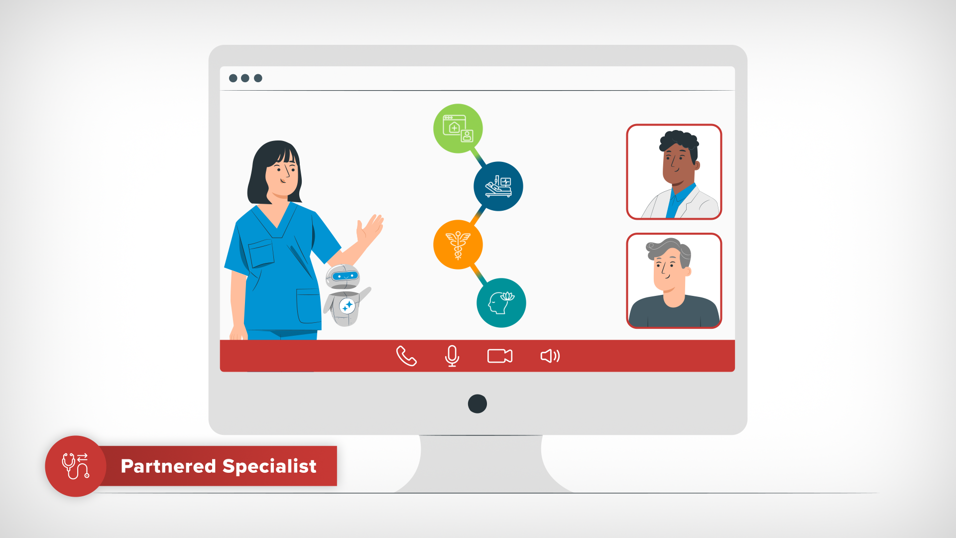
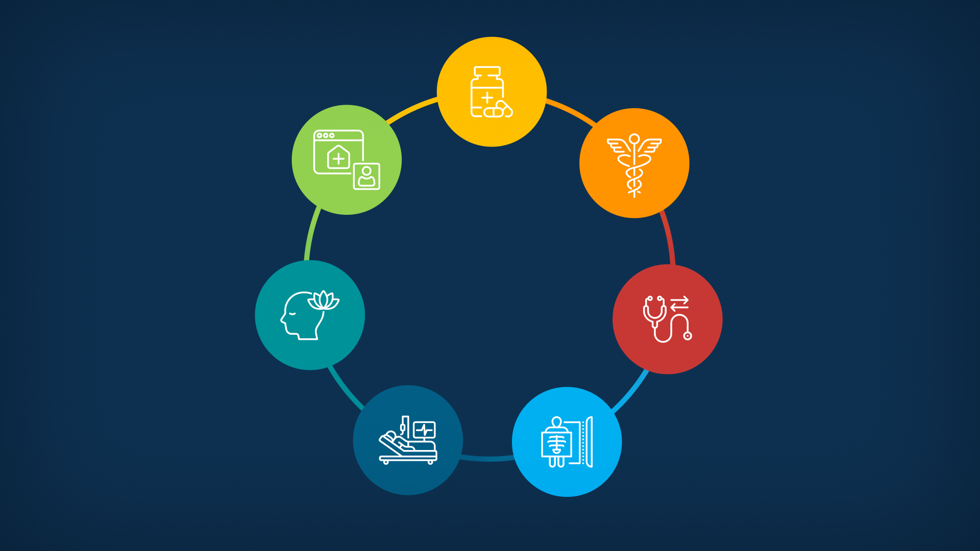
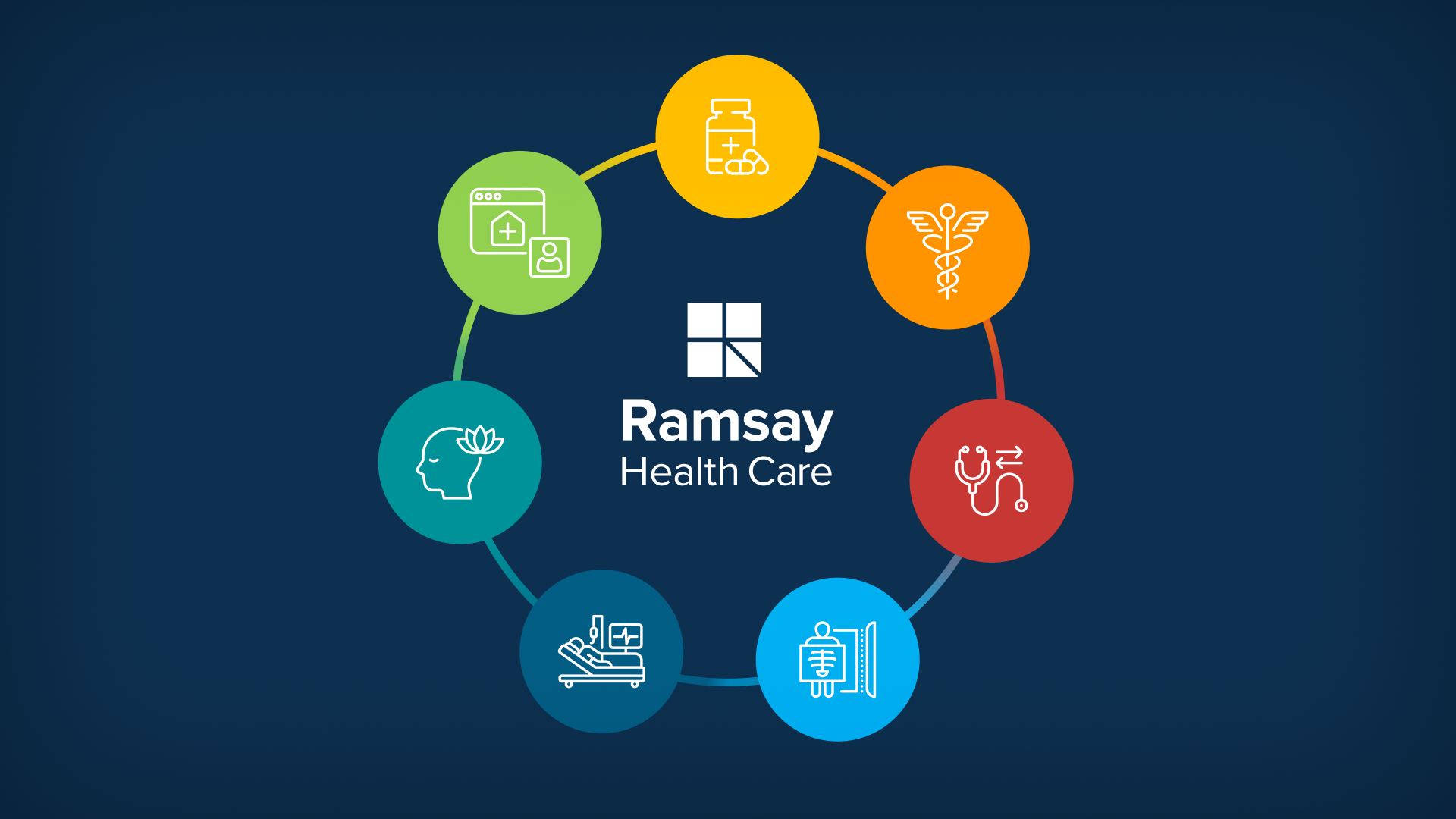
Strategically, the animation needed to show cohesion between all the sub-brands in Ramsay’s digital ecosystem. This needed to be achieved by a careful use of brand colour along with a bespoke set of Sub-Brand Icons that I created.
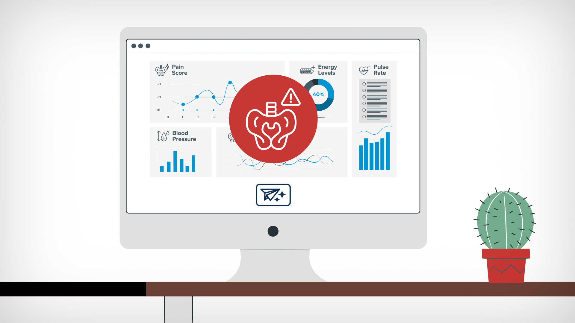
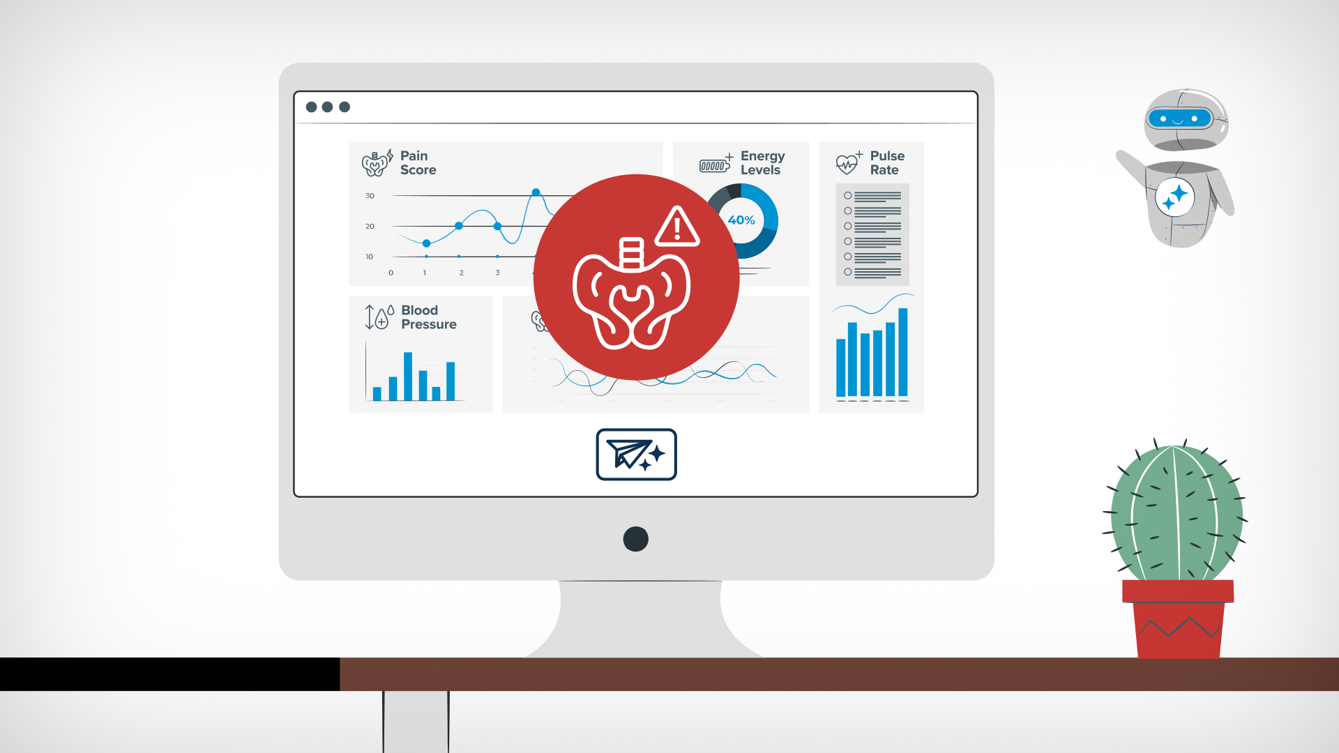
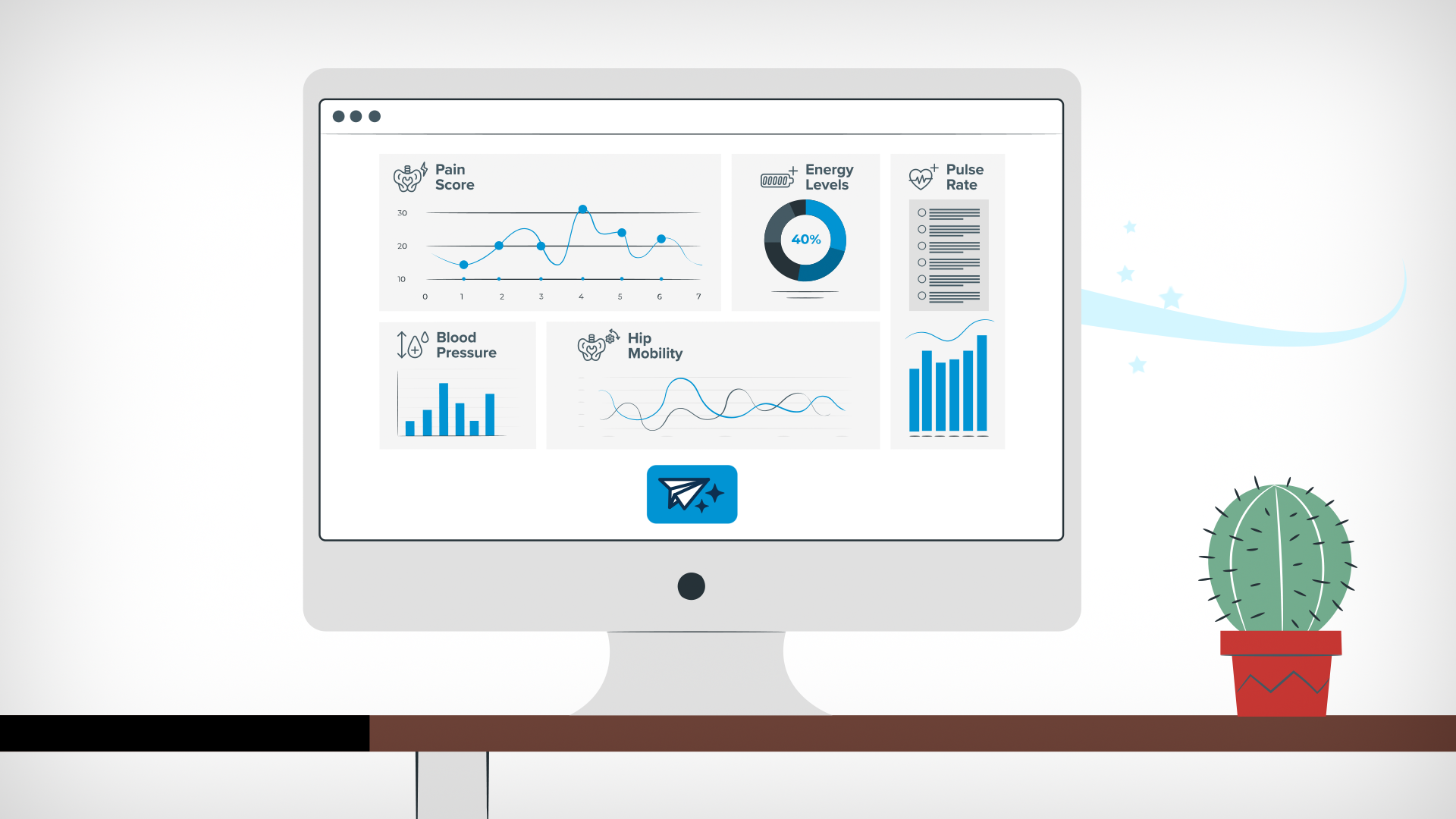
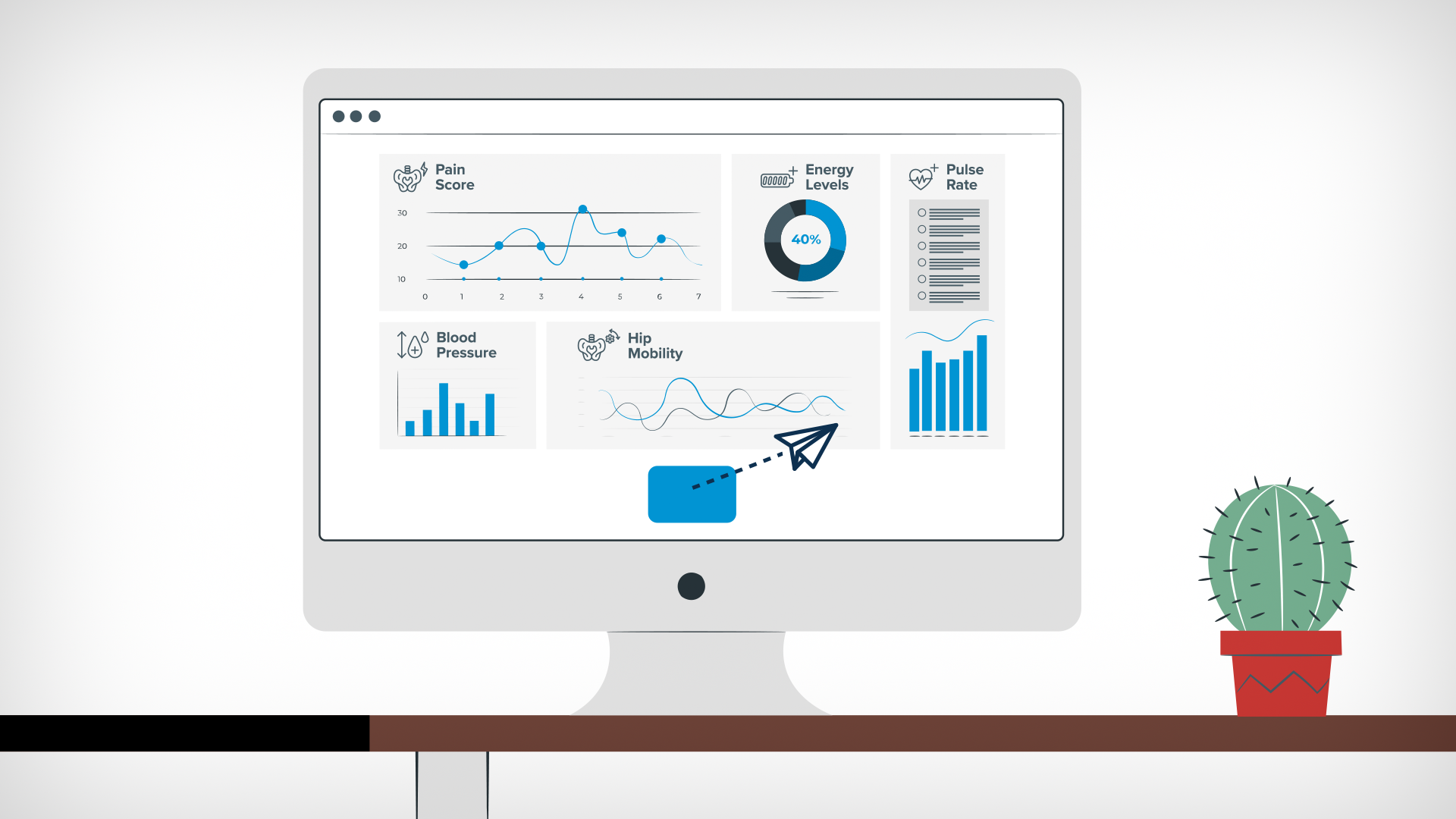
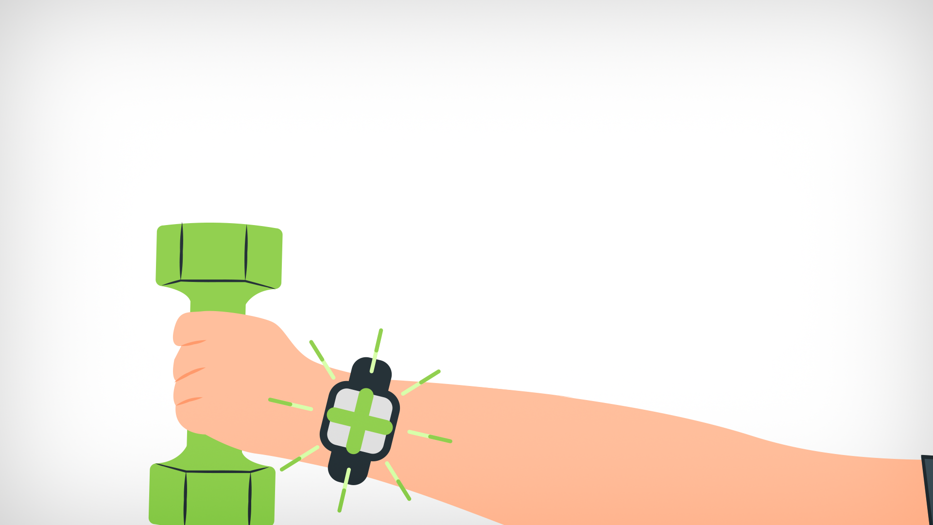
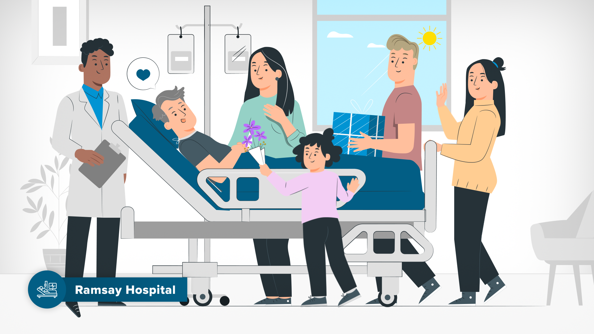
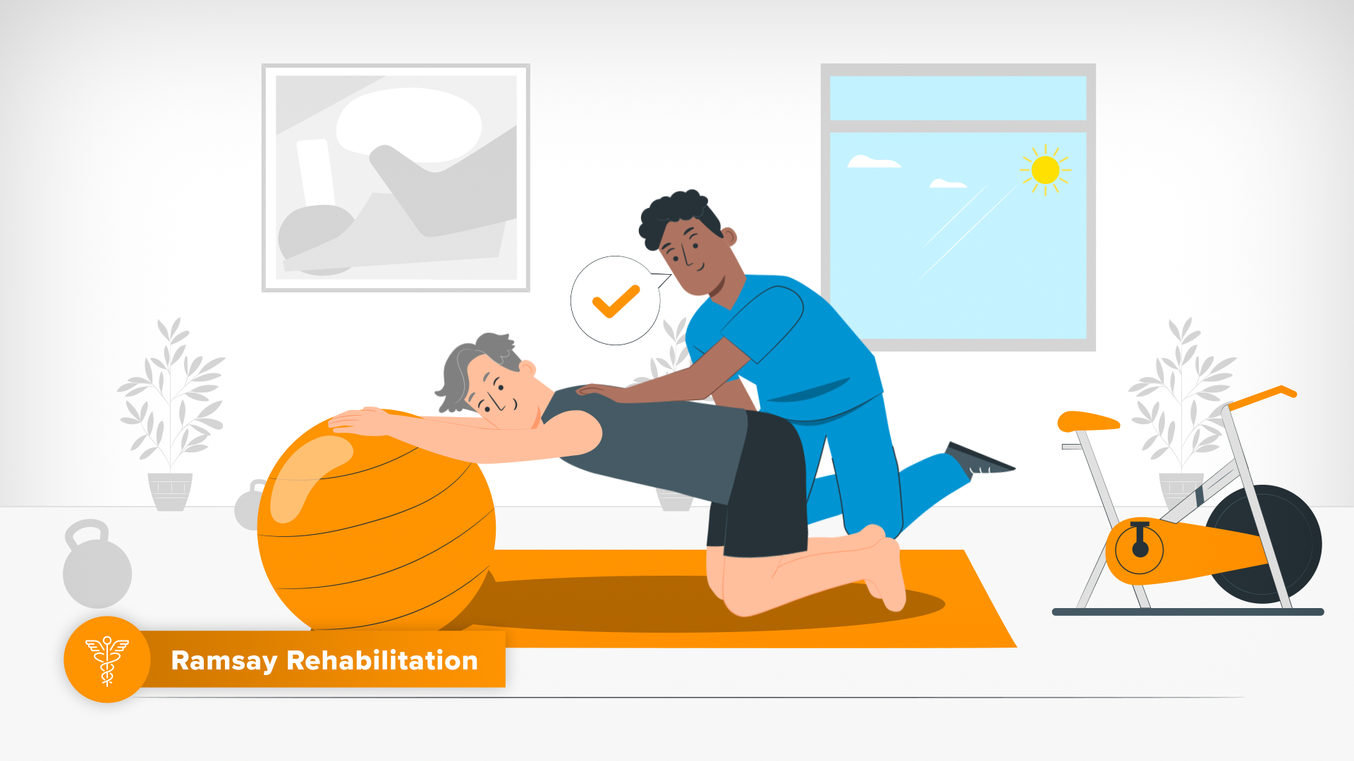
The need to simplify complex concepts such as health data and graphs, digital processes, the human / robot care navigator alongside human emotion, narrative and diversely branded sections, really tested my visual communication skills.
Working directly for a client’s in-house team meant I was working without the support of a creative agency and producer, meaning more communications, strategy and project success risk on my side.
-
00 Briefing & Starting Assets
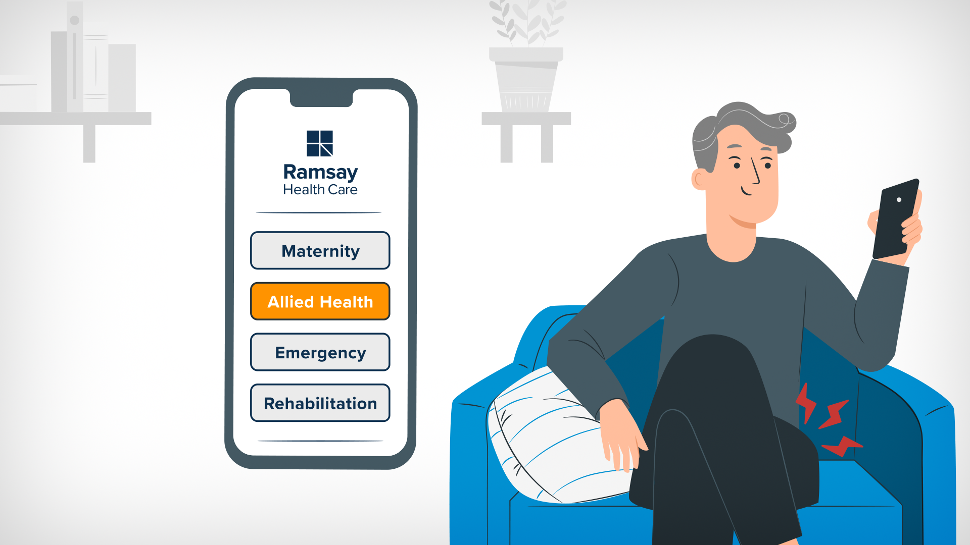
Upon being briefed, I was given a draft of the script, a one page pdf visual representation of the stages of the Future Customer Journey and Ramsay’s Brand Guidelines and logo.01 Script to Visuals Breakdown
From the script provided, I analysed and broke down each scene to draft written descriptions of how the visuals could most effectively be represented in terms of design, animation and messaging.My Visual breakdowns were then reviewed by Ramsay’s design team, and I revised up to their approval. Once we had an approved Visual Breakdown of the script, we were ready to start creating visuals.
02 Style Frames & Design Systems
Given the tight time constraint, I focused on developing a set of style frames that established design systems to ensure consistency and cohesion across illustration, iconography, colour, typography and layout grid via example base compositions. Developing this early on ensured a seamless process in developing storyboards, as I could get through the work at speed while maintaining consistency and overall cohesion.
03 Asset Creation
Primary assets vital to the narrative and brand strategy were created and approved first so they could be used successfully in the storyboard.Sub-Brand Icons
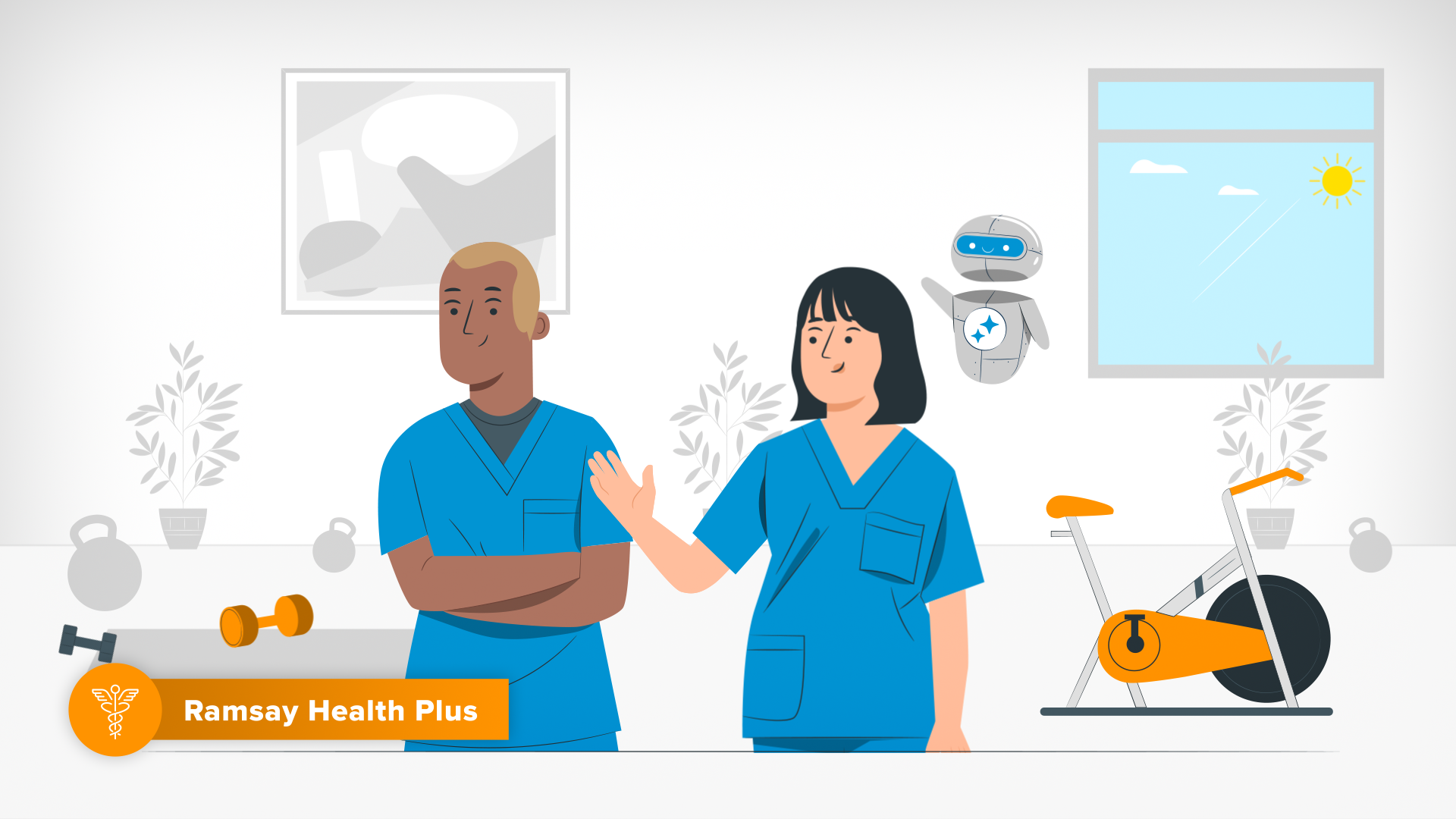
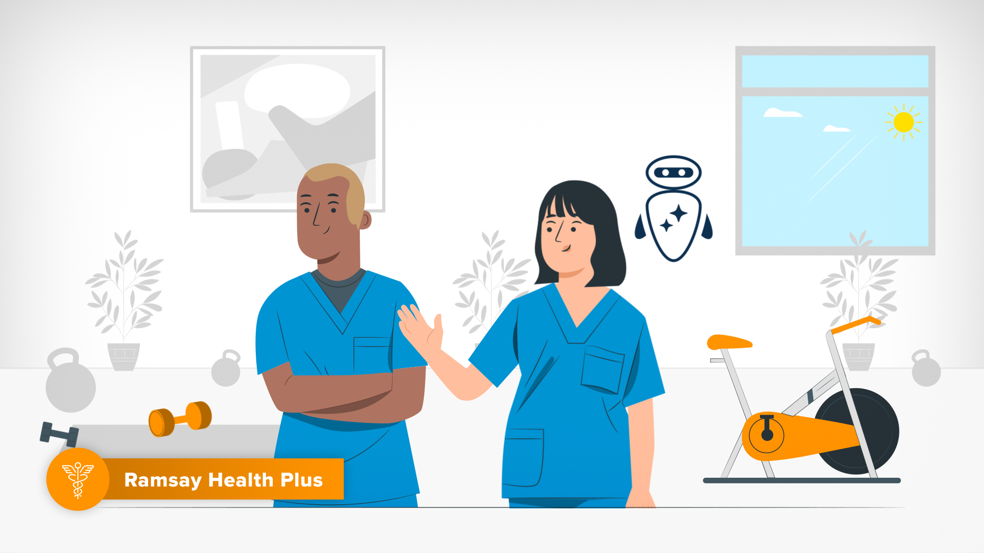
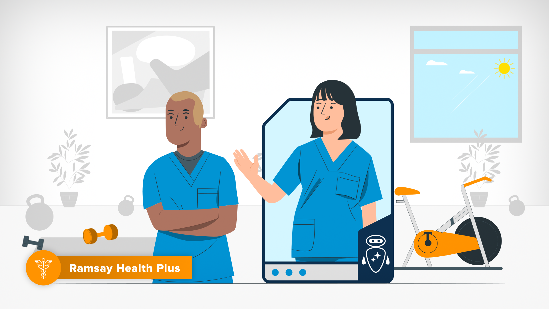
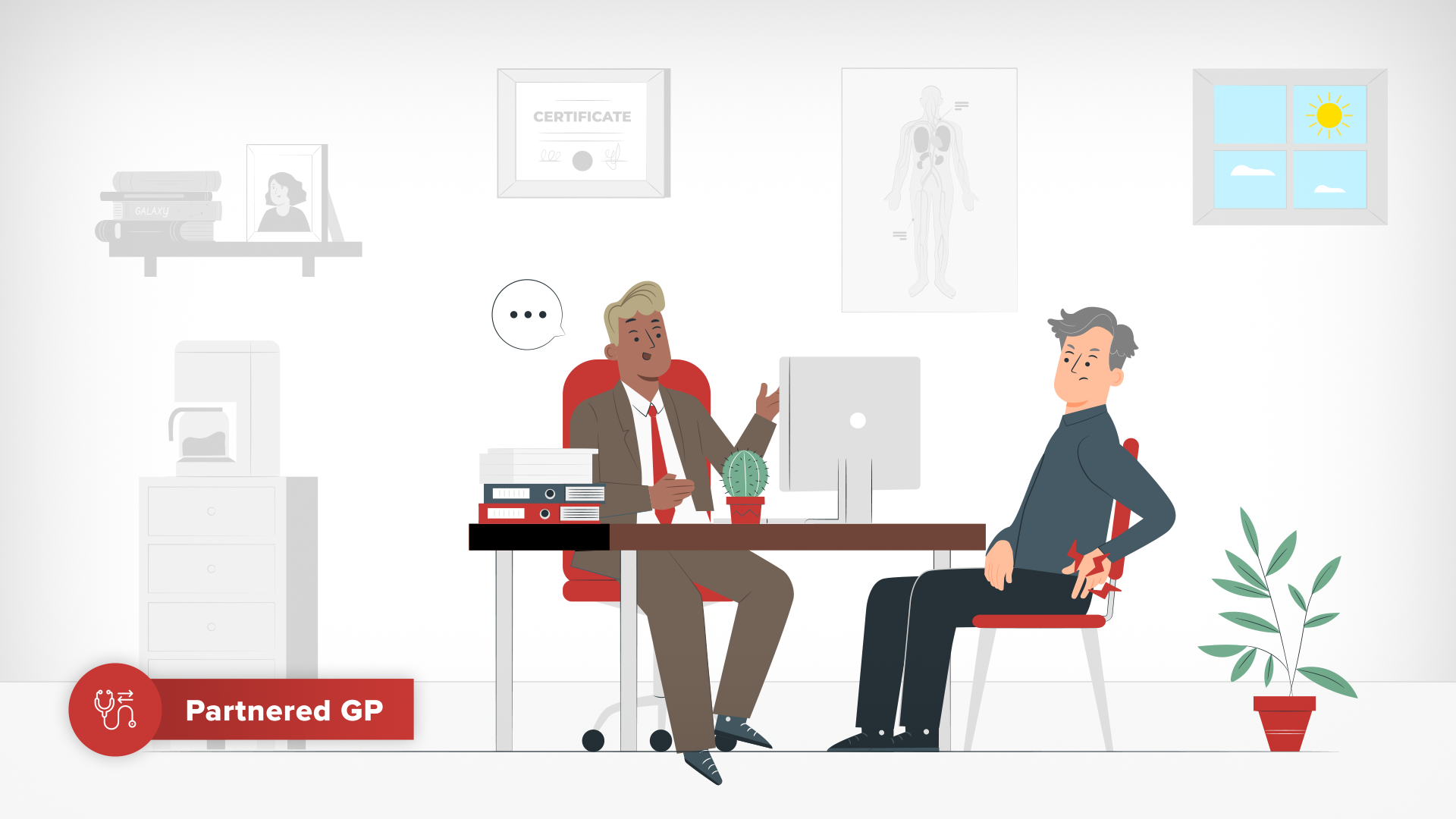
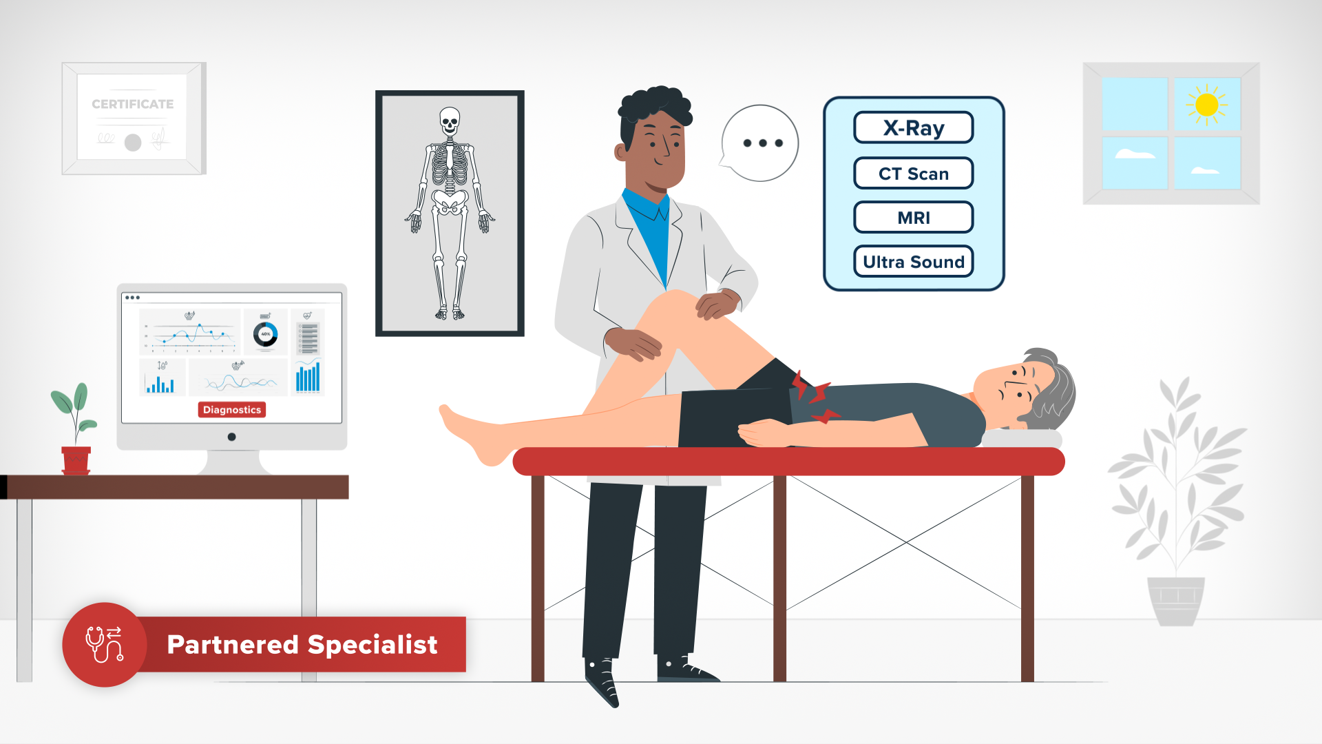
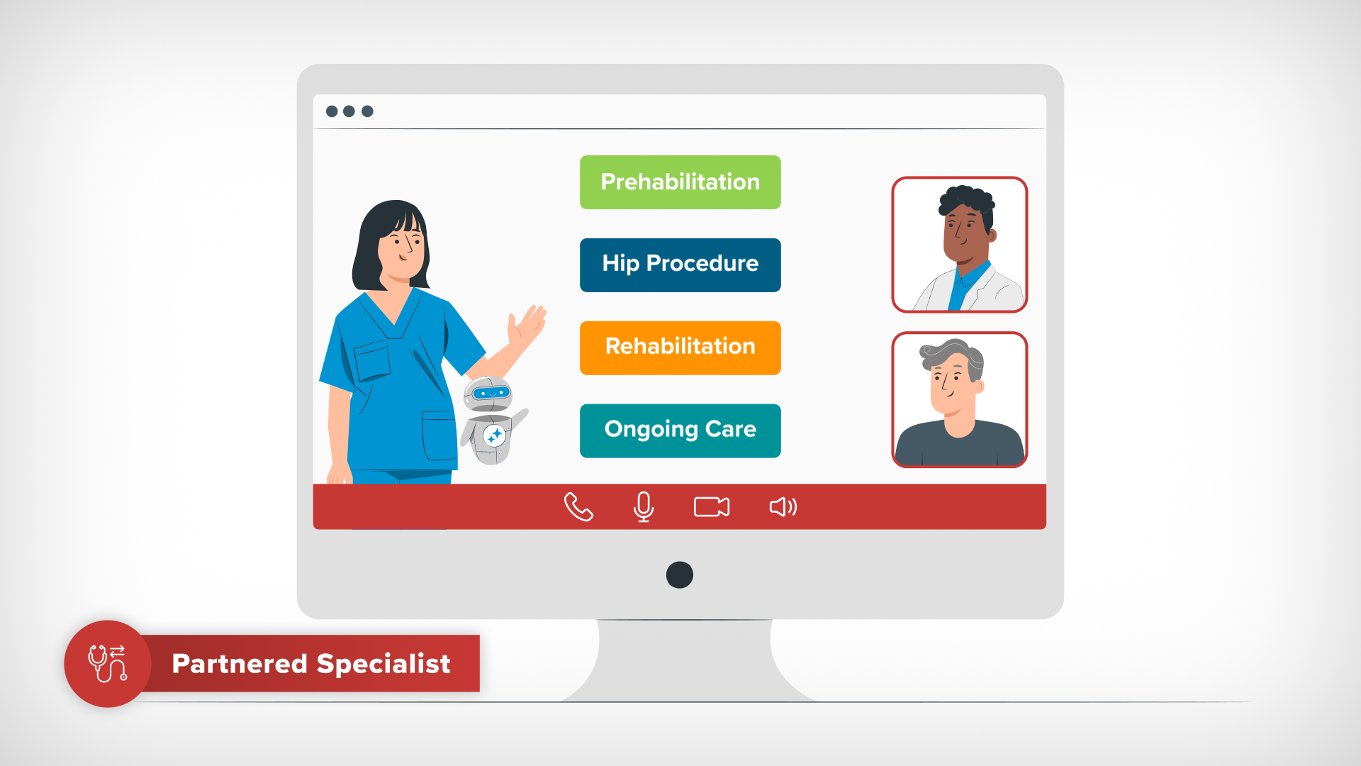
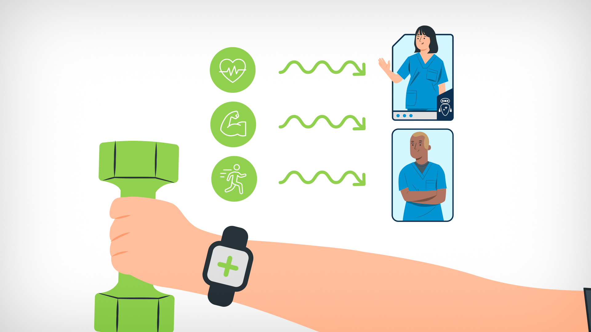
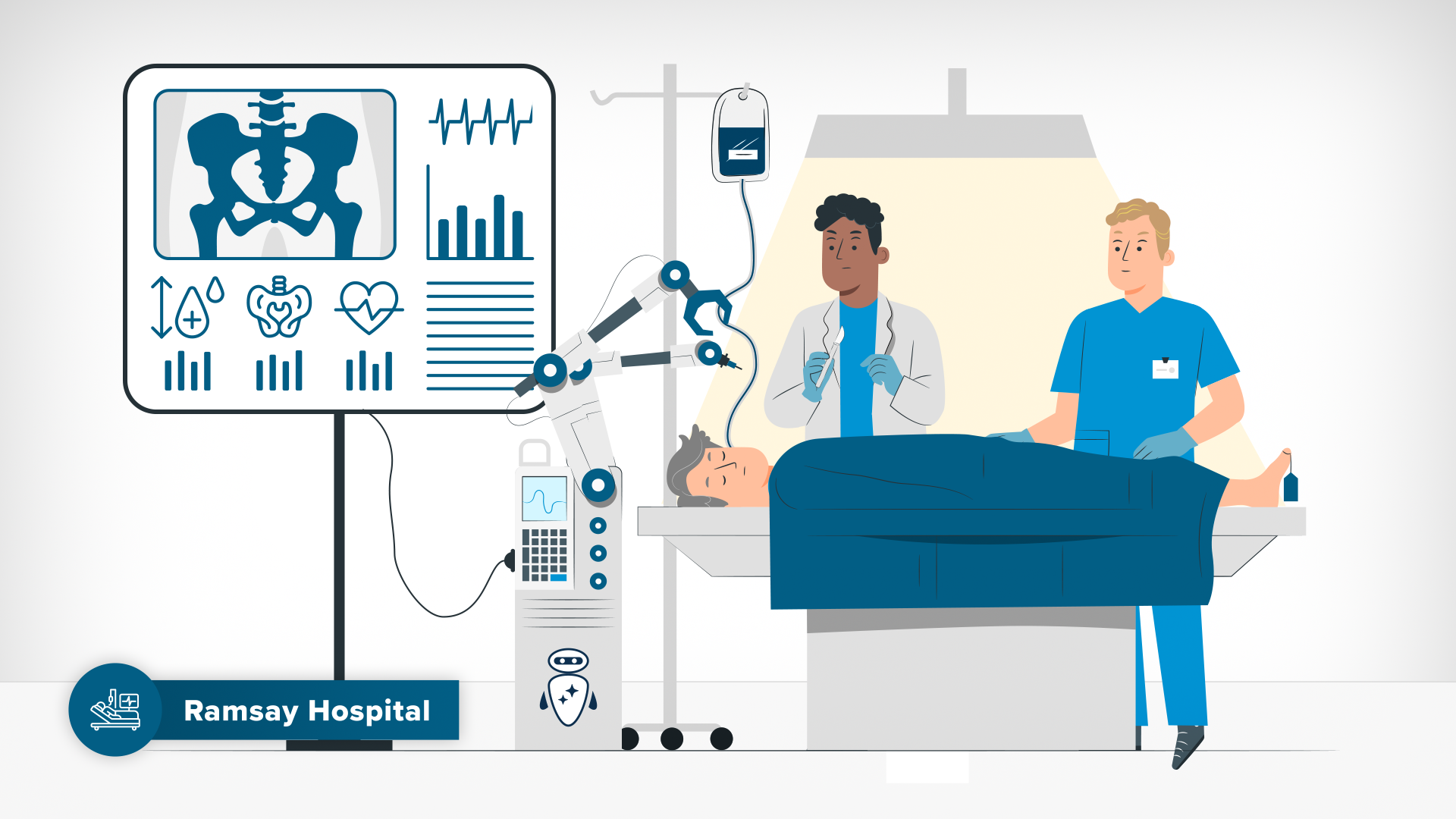
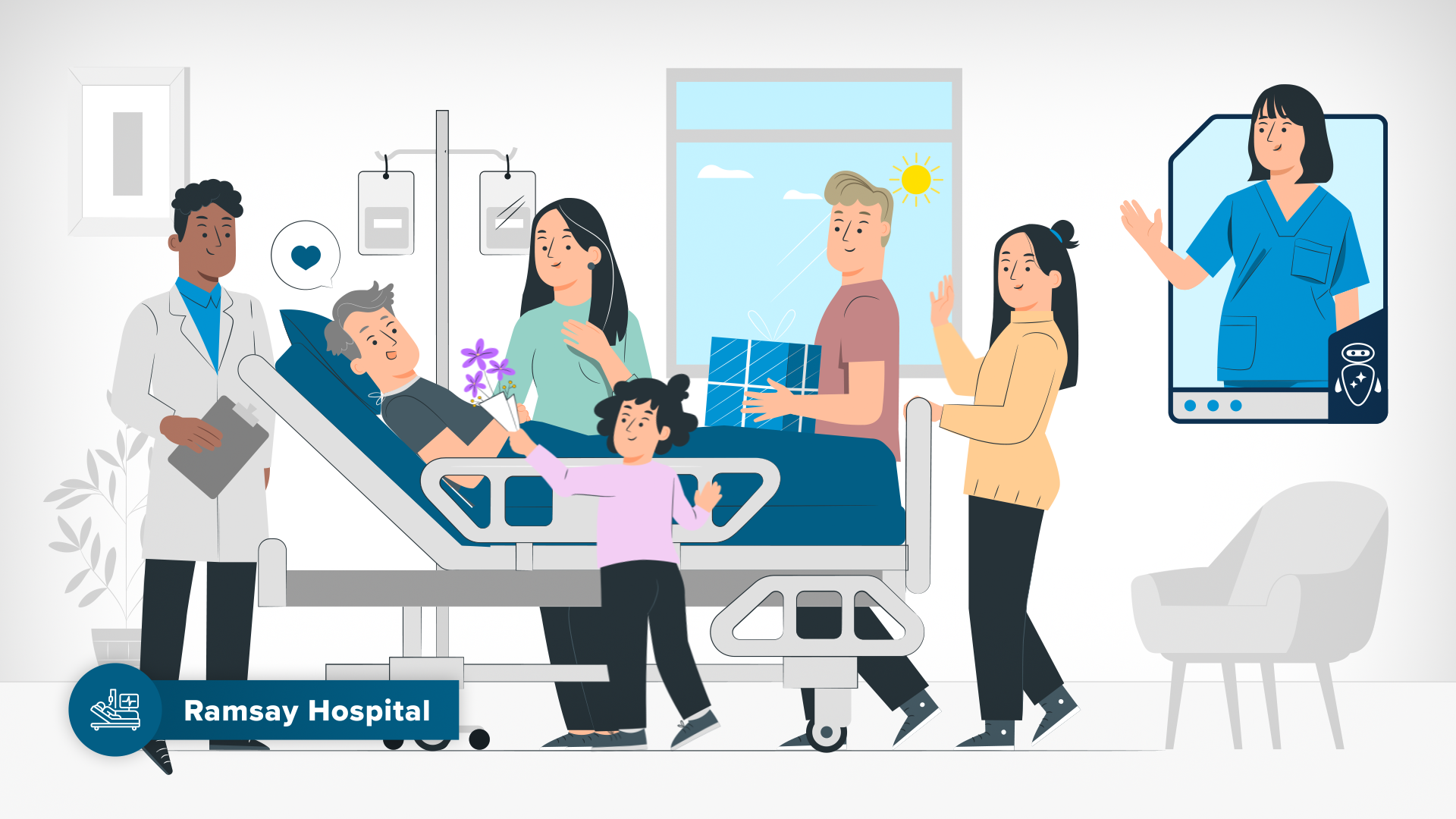
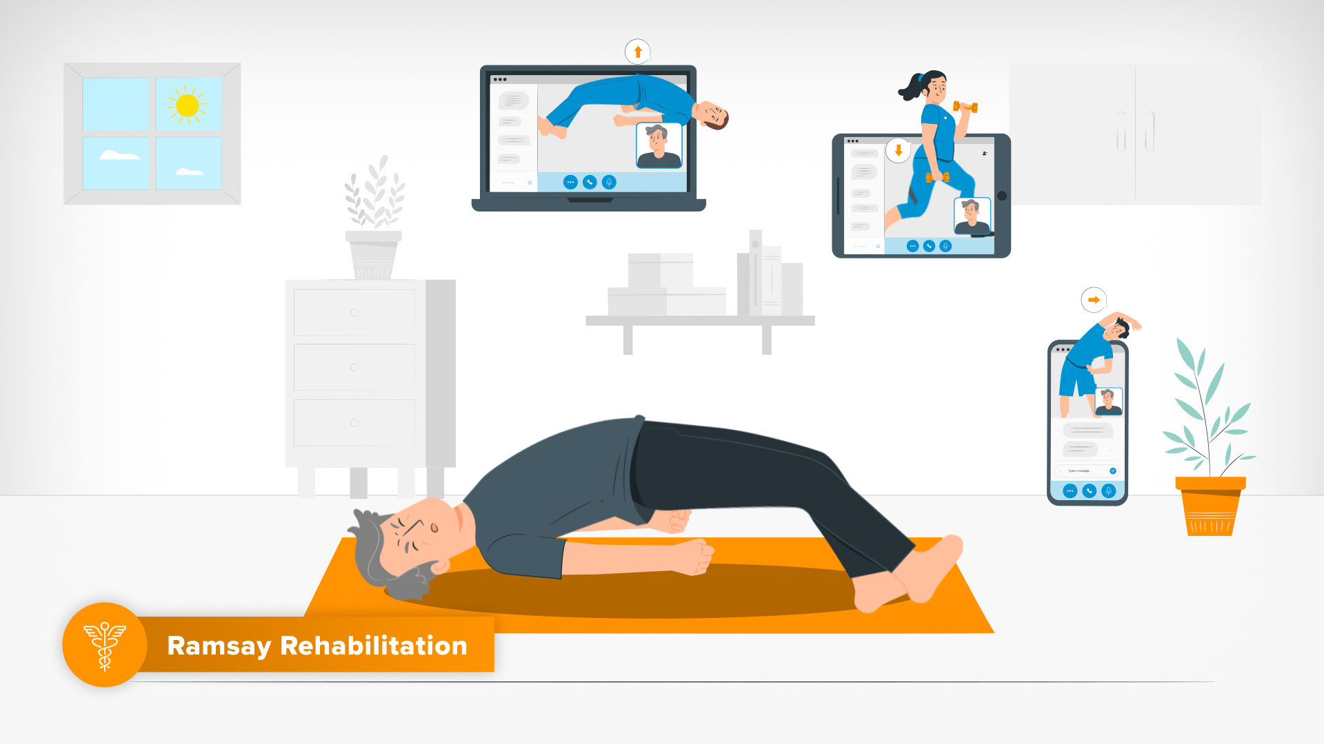
I created a bespoke set of icons to represent the individual sub brands which each had their own distinctive colours and represent different categories of health services. When these icons are displayed individually in scenes relevant to that particular health category, the sub-brand colour would be used on specific objects in that scene for association with that Sub-Brand, and a Sub-Brand Super was overlayed bottom left screen for the duration of that scene. When depicted together, often in the Sub-Brand Circle Lockup, adjacent icons are joined by a coloured line with a gradient between the two sub brand colours.Care Navigator Nurse, Robot & Screen Lockup
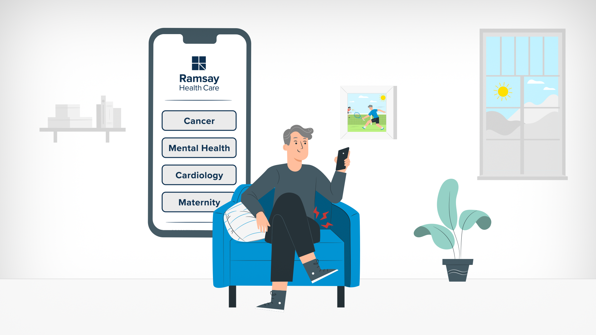
I created a visual representation of Ramsay’s Care Navigator, a patient centric care management service powered by AI, which is represented by a human nurse and a friendly robot that live together in a dynamic digital screen. The friendly robot is both in illustration form (taken from the Storyset platform) and icon form (which I created). The digital Care Navigator screen acts as a graphic device not only to house the nurse and friendly robot but can expand to display graphic communications shared by the Care Navigator.AI Referral Button
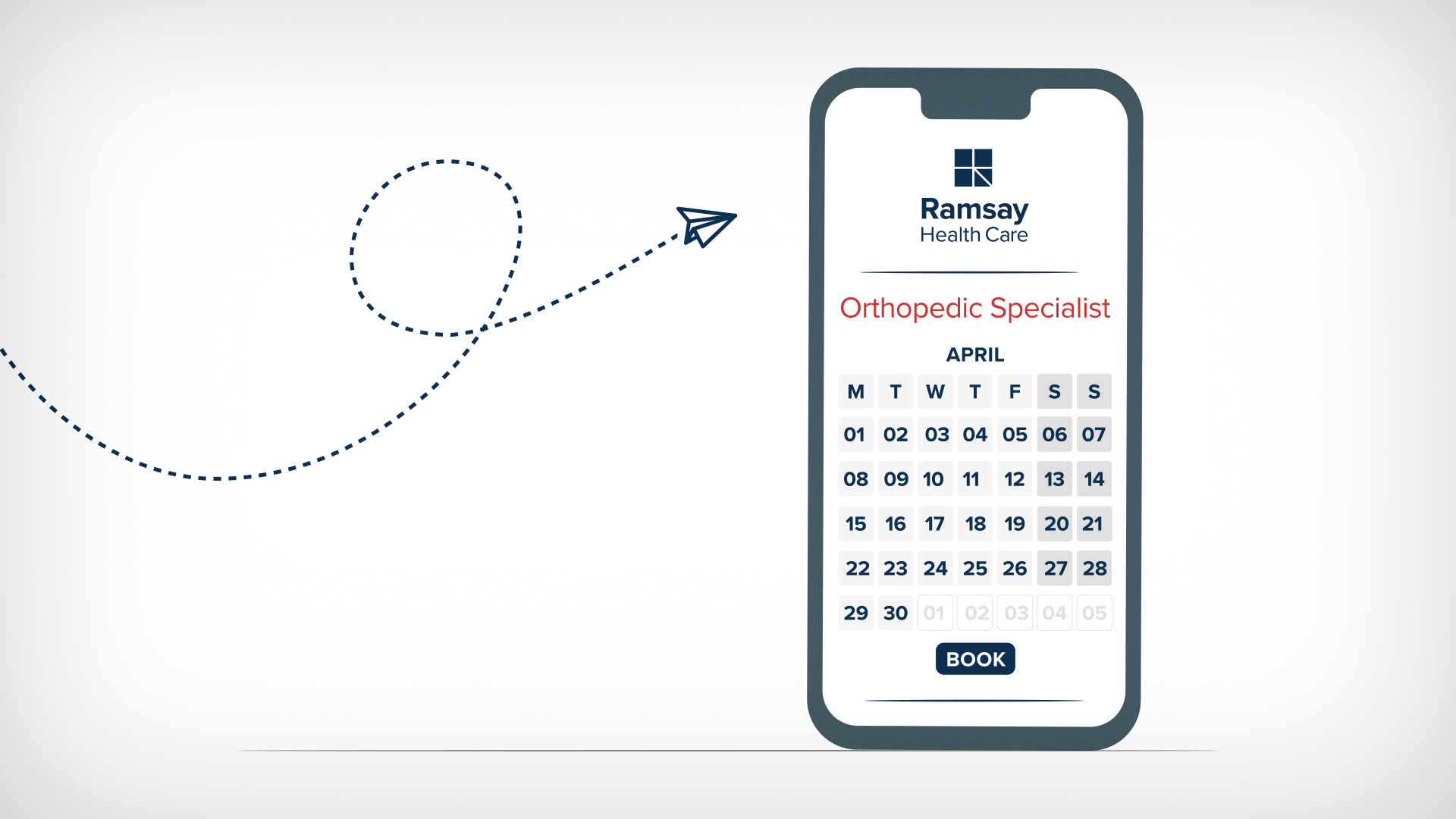
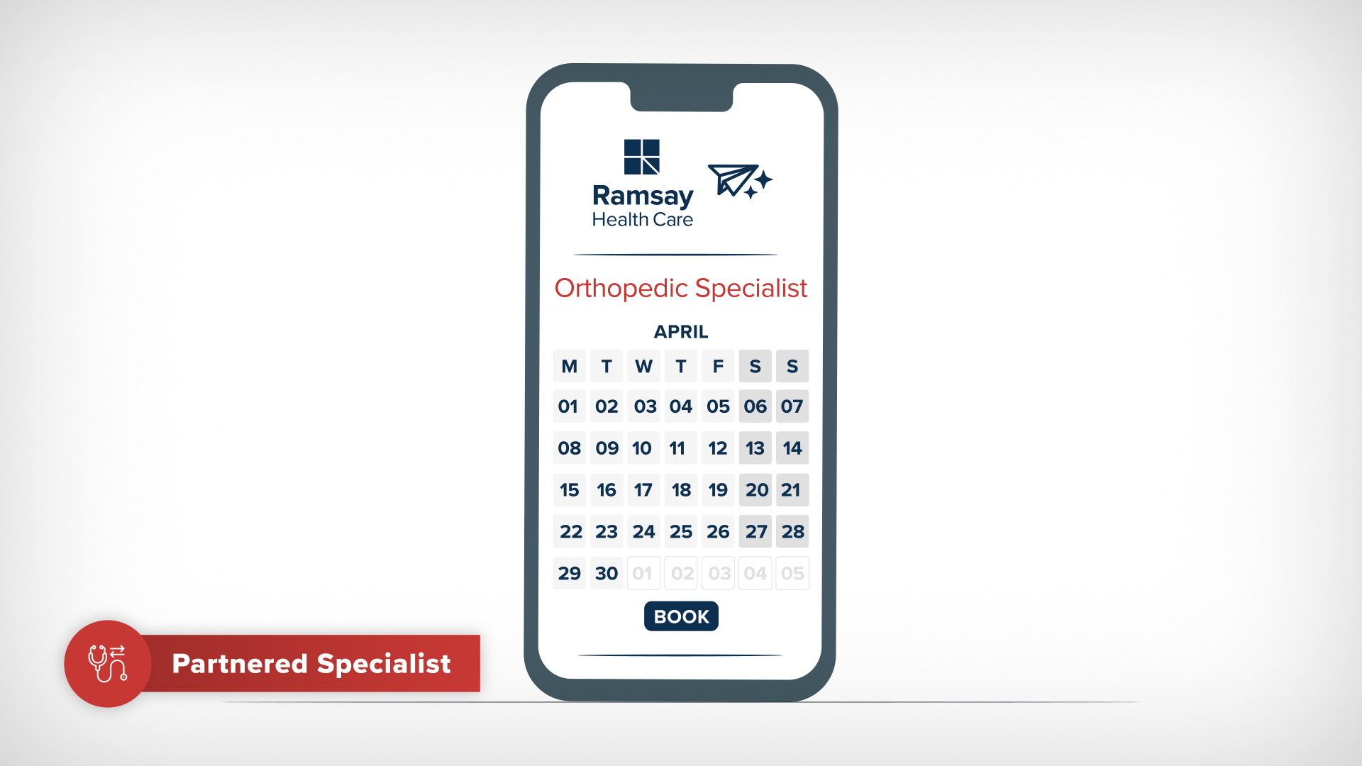
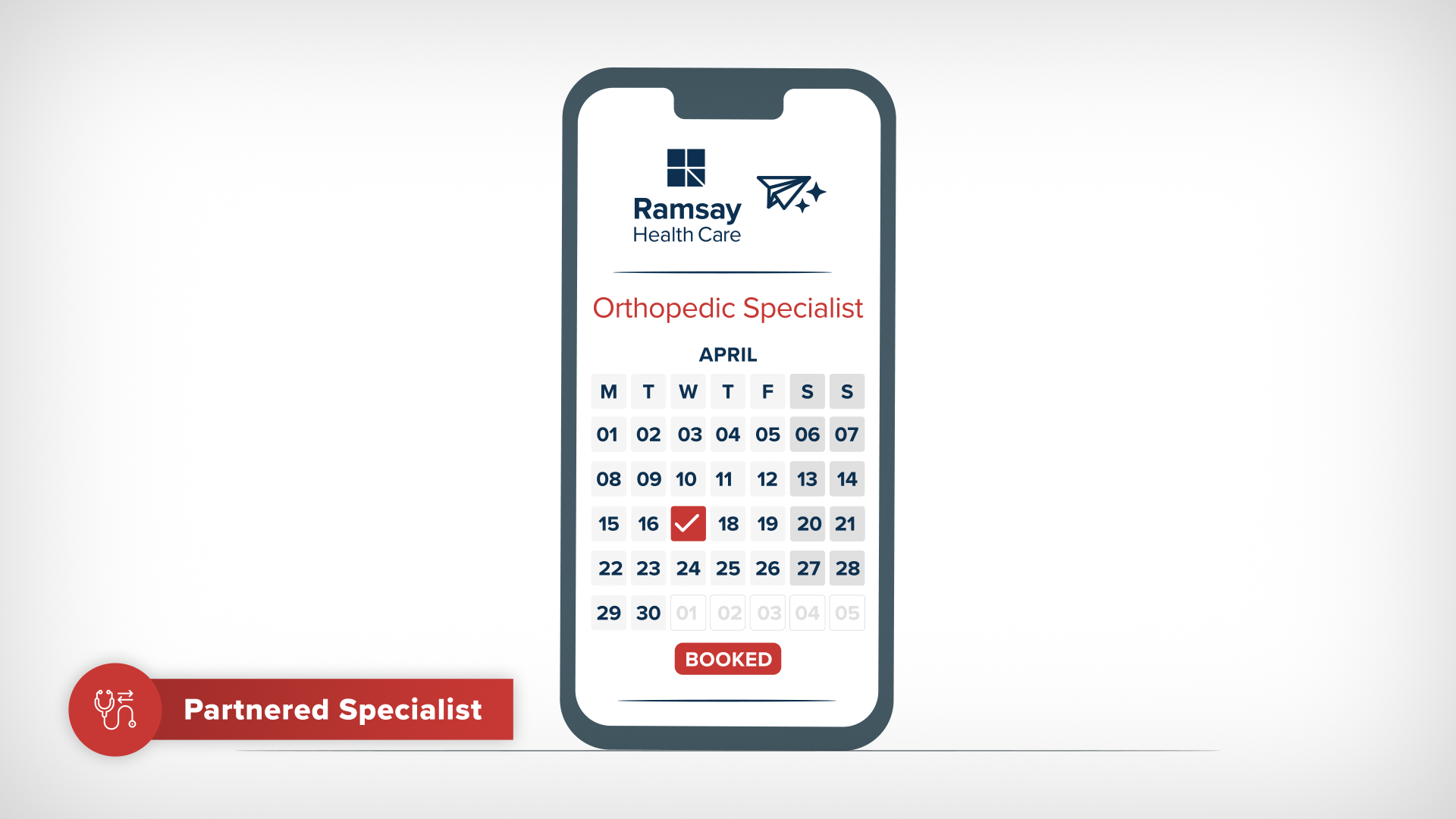
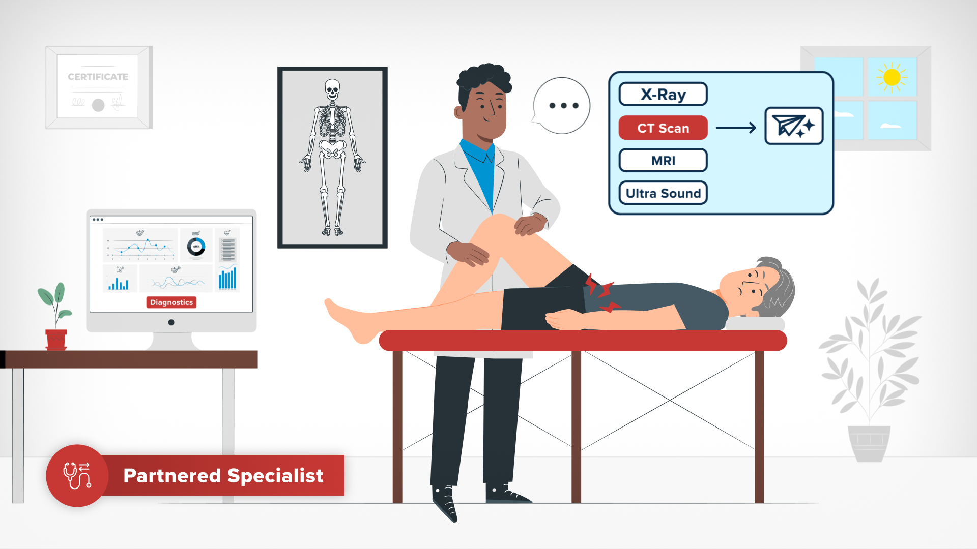
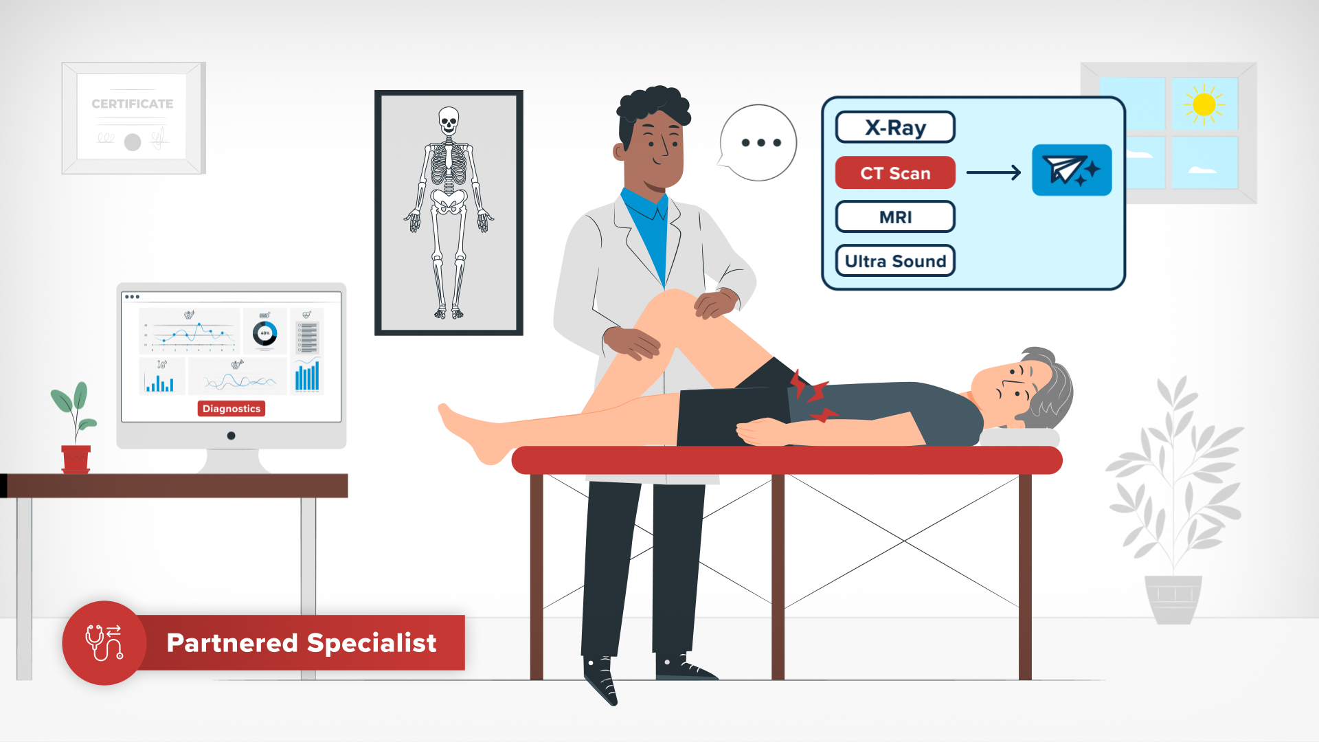
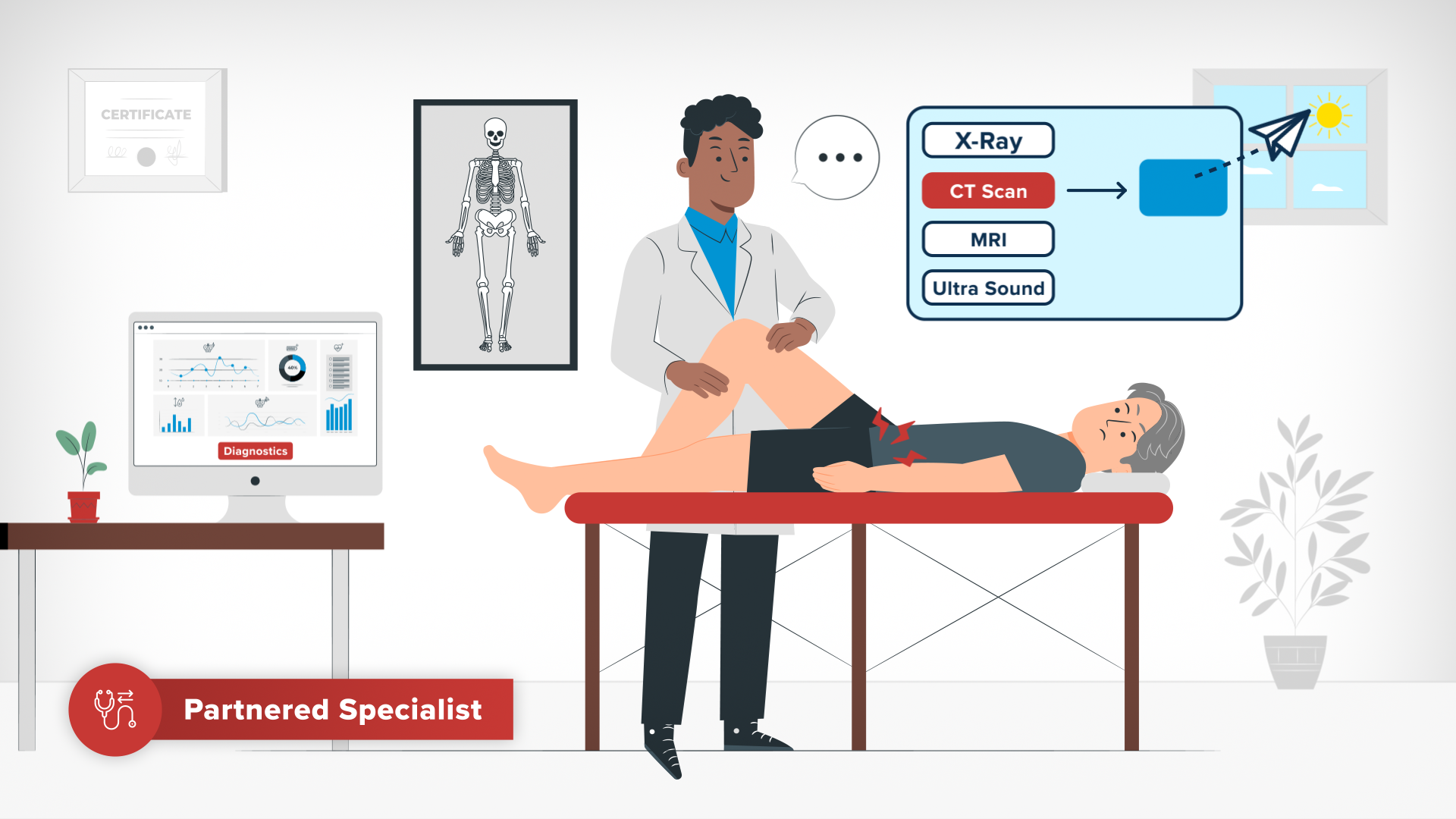
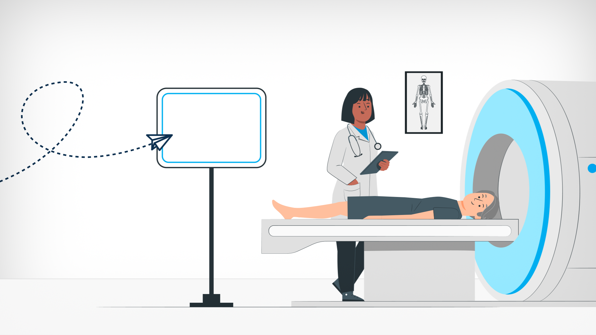
I created an AI Referral button that consisted of a paper aeroplane icon (symbolic to messaging and emails) with two stars (symbolic today of ‘AI influence’ in tech). When the button is pressed it turns Ramsay Blue and the paper aeroplane takes off and flies to its referral destination followed by a dotted flight path.Health Data Icons
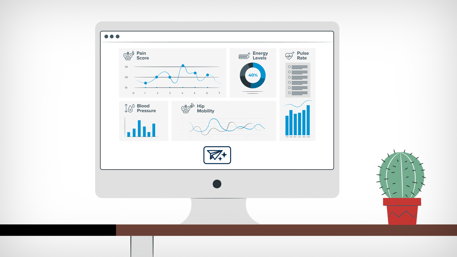
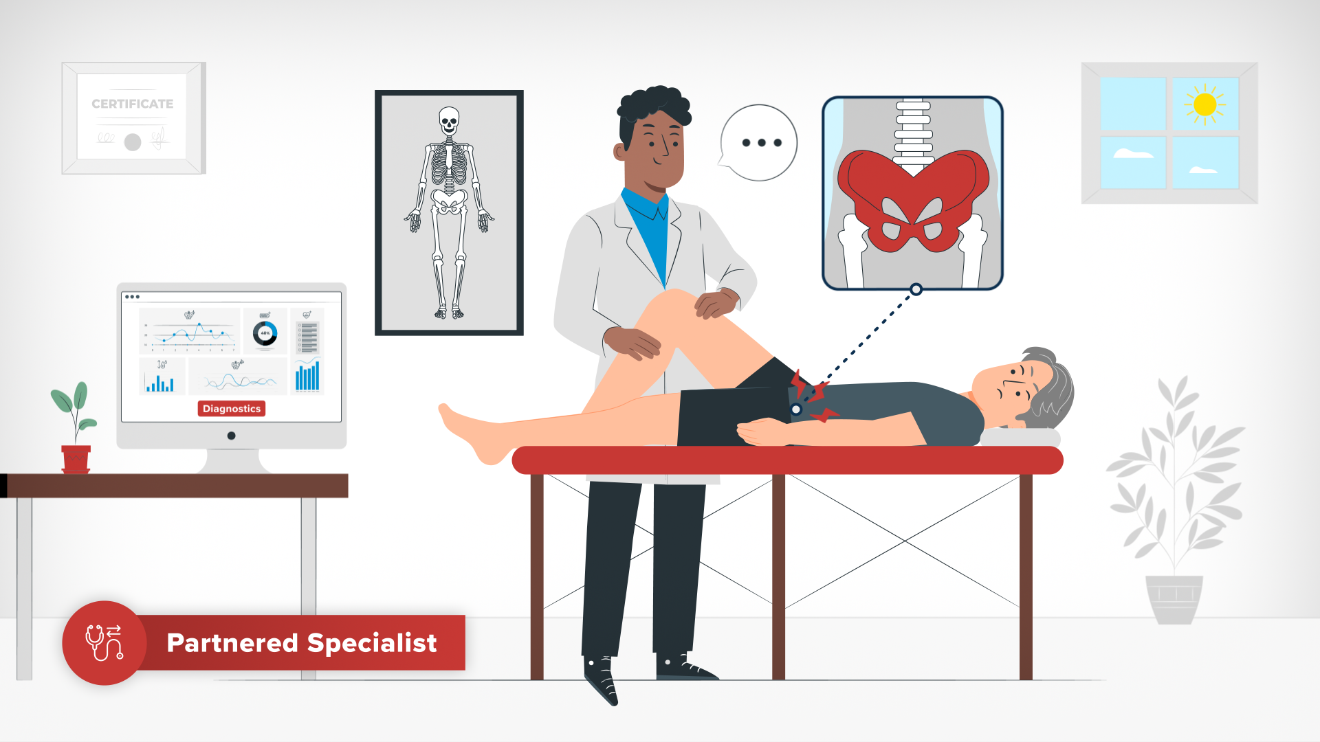
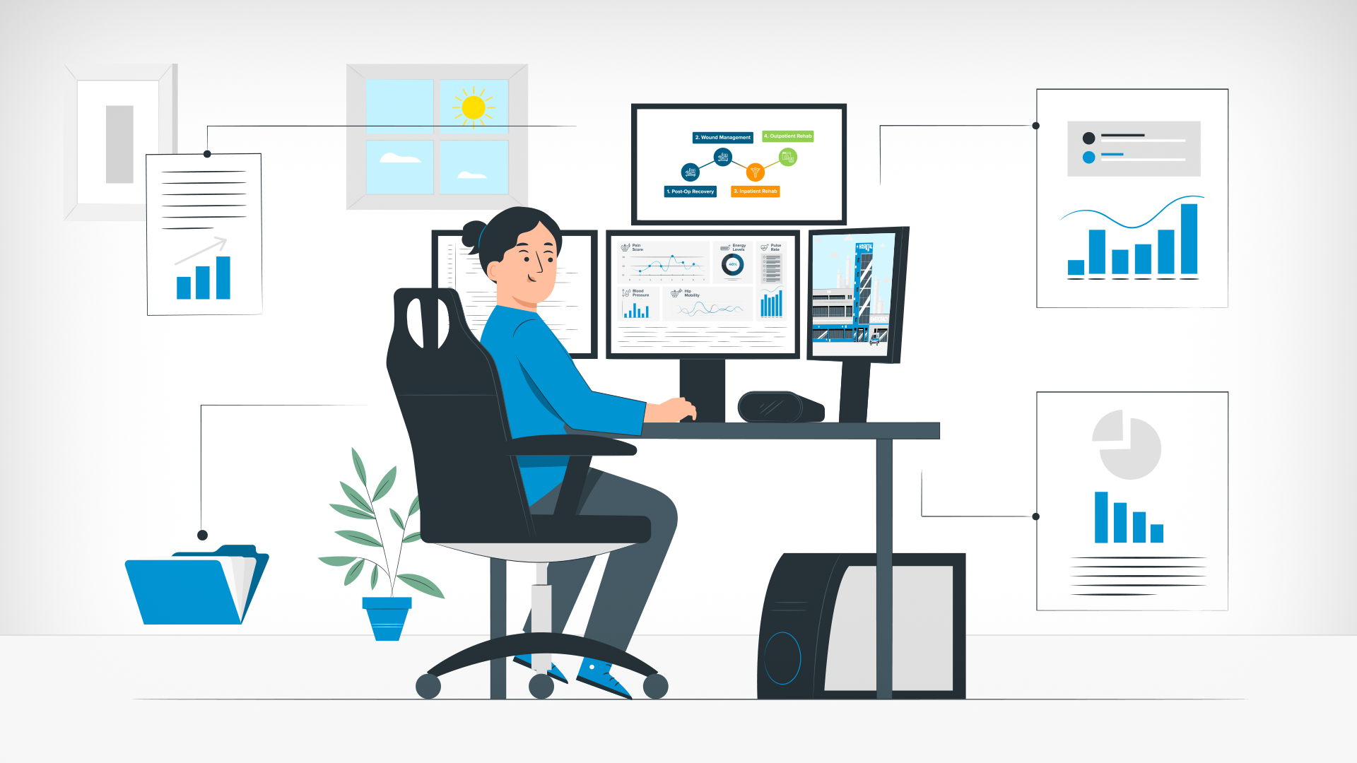
I created a set of health data icons used across the video visually represent data on screens for reviewing progress (GP Visit), determining diagnostics (Specialist Visit) and live monitoring (surgery scene).Screen UI Design Layouts
I created the UI layouts for phones, desktop computers, monitoring screens and various popup windows representing digital processes.
04 Storyboard Concept & Design
I created 60+ storyboards from concept to final design. I pulled illustrations from the Storyset platform, altering and illustrating where necessary, to build illustrated compositions alongside typography and iconography. Storyboards were reviewed on the Miro Board platform in organised fashion with the client design lead, alongside a more detailed written dialogue.As I worked through the storyboards, I continued the process of Asset Creation as needed for such things as for mockup platform UI, additional icons, and where StorySet illustrations were not provided or needed to be reworked.
05 Animation & Editing
To kickstart the animation process I created an animatic from the storyboards to set the timing of the VO (first with my own voice as a cold read, later replaced with professional VO). Once approved, the timing in the Animatic allowed me to built out the vector elements for each storyboard in after effects correctly along the timeline.During the animation process, as the slowish pace was largely limited by time needed for legibility and understanding complex concepts, special consideration was taken retain retain visual interest such as dynamic transitions between scenes, slow camera zooms and looping facial expressions on characters during scenes, and timed micro-interactions of elements when referred to in the narrative.
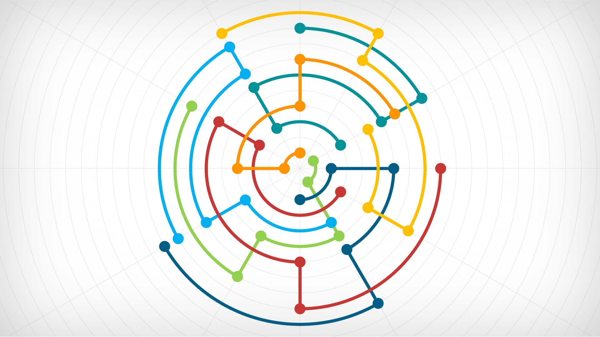
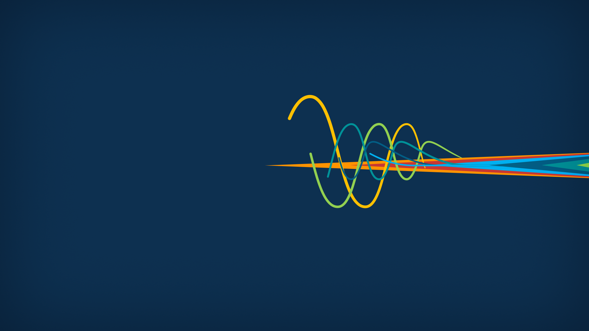
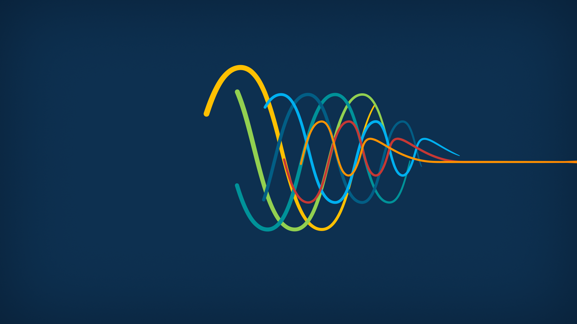
I built an engaging intro and outro animation to help engage the audience from the beginning and end on a high note. The intro depicts lines travelling between points across a circular web in the various sub-brand colours that resolve into our sub-brand icon circle. This scene portrays the future vision of Ramsay across the digital landscape.
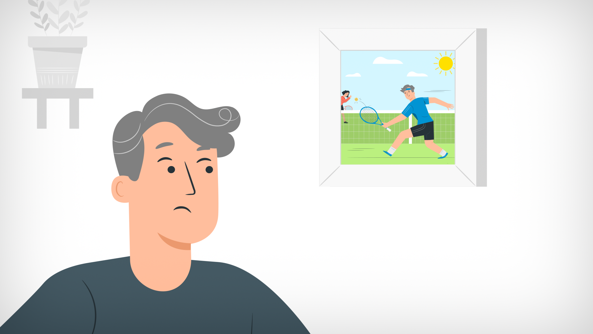
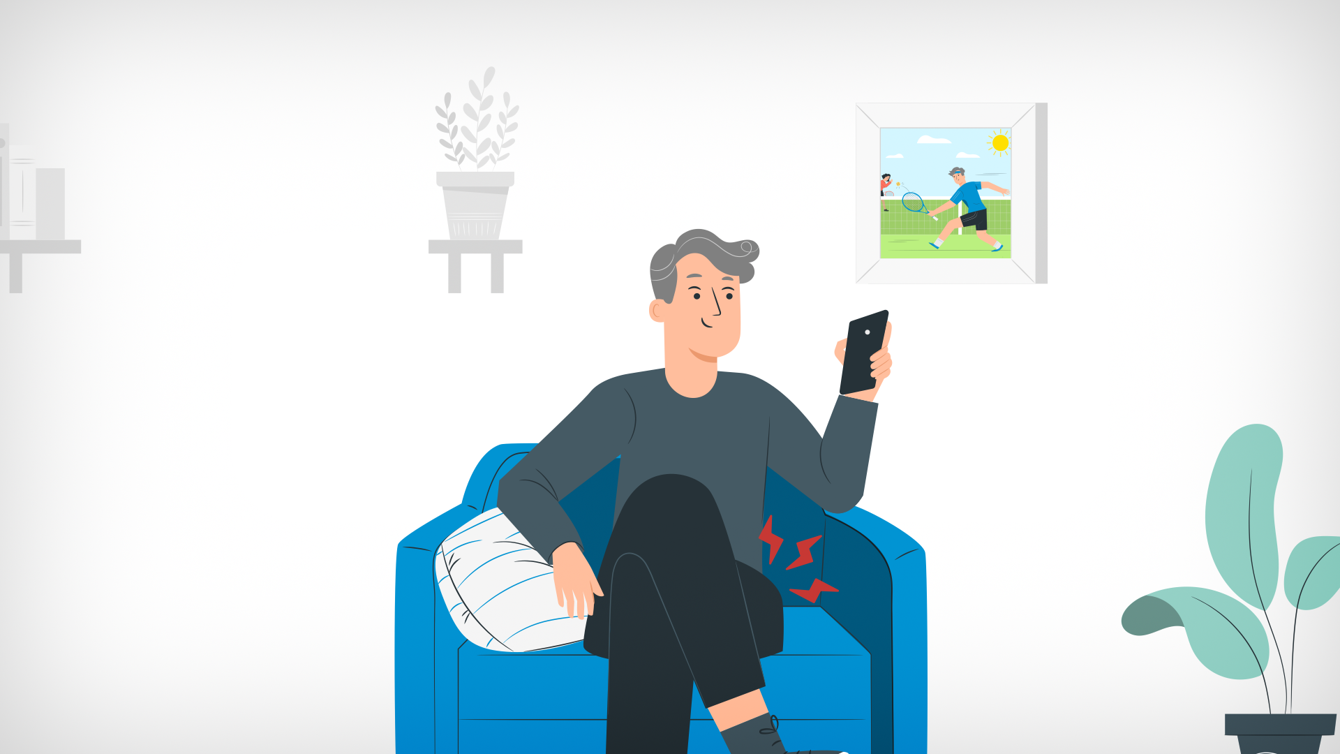
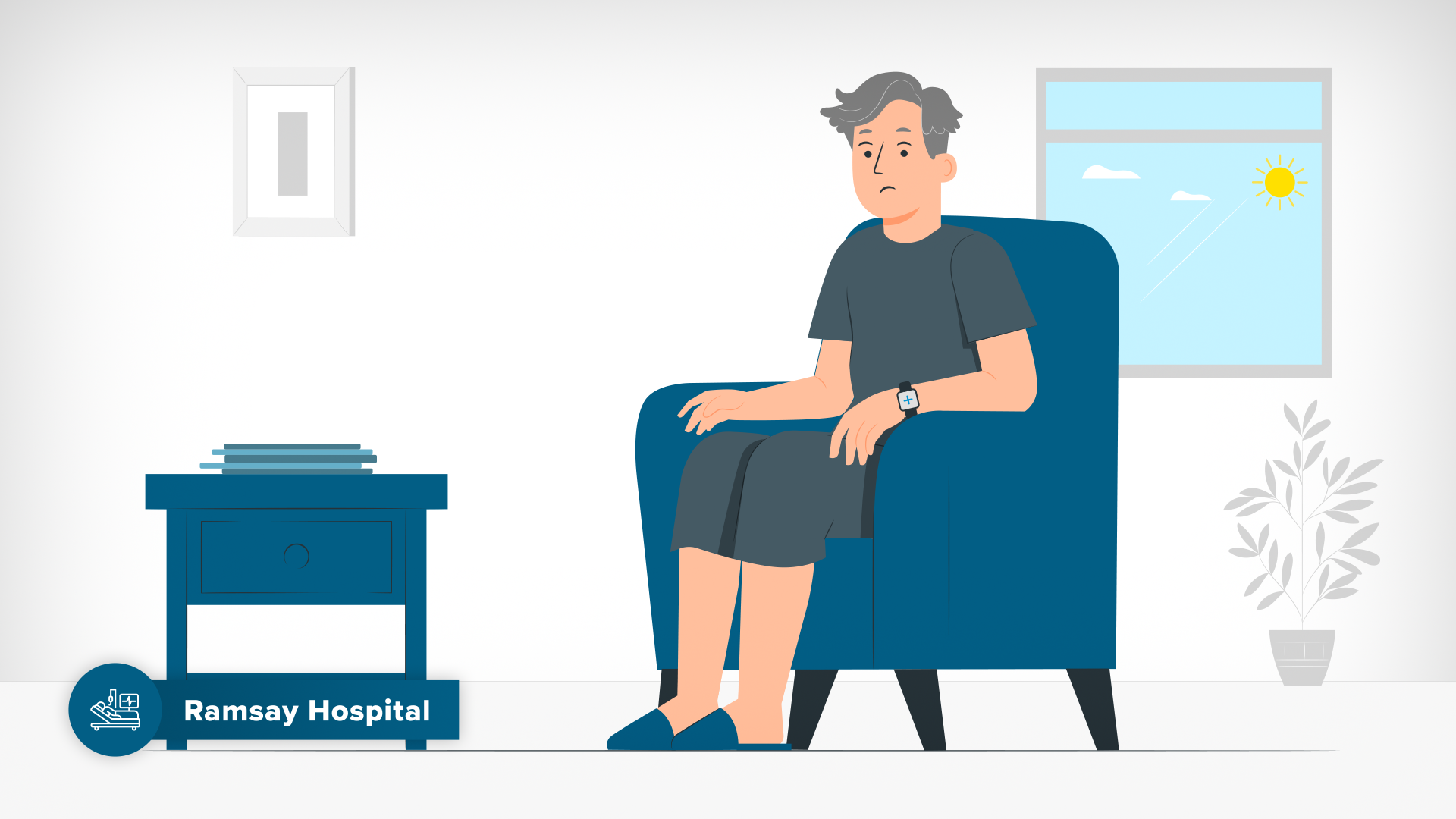
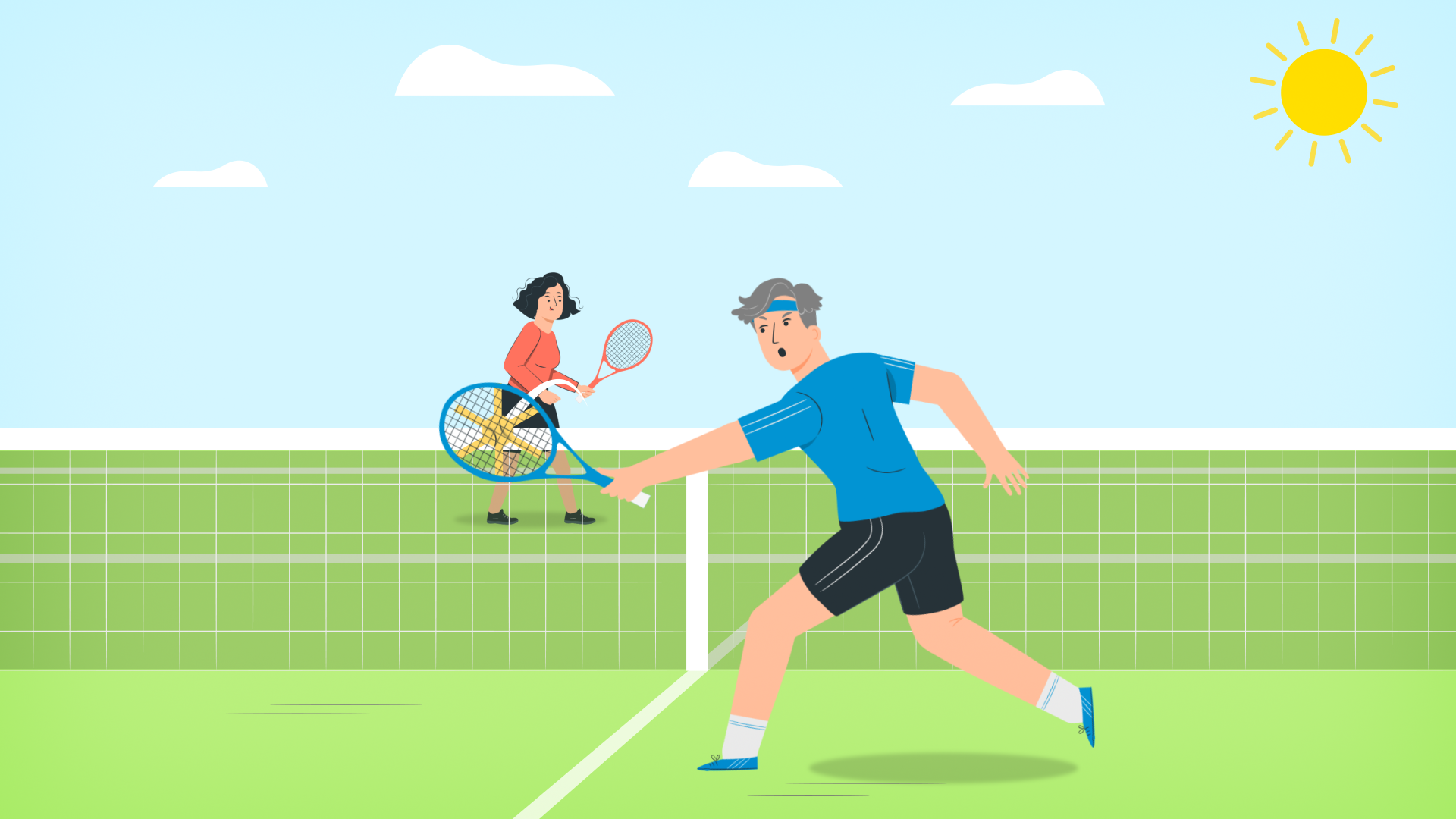
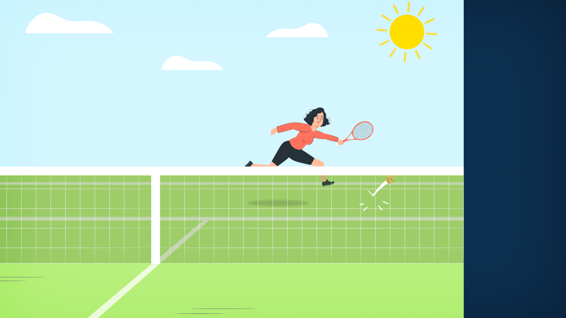
In the final scene the camera zoom’s into the picture of Simon playing tennis in the past, the picture comes to life as Simon plays a winning shot and the ball transitions into a colourful display of speed lines that resolve harmoniously into the Ramsay Sub Brand Icon Circle to conclude the video. This visual transformation of Simon’s ‘End Goal’ into the same Sub-Brand Icon Circle Lockup’ from the video intro via the tennis ball’s trajectory from Simon’s winning hit is a defining moment in the piece where we come full circle with a full appreciation of the transformational power behind Ramsay’s sub-brand collection in the future customer journey.
06 Review & Revisions
As this was a long animation (4+ minutes) I shared each scenes for review while I worked on the following scene. Having an approved Script Visual Breakdown & Storyboard design kept revisions reasonable and pragmatic, so this was a fairly straight forward process. Key elements focused upon involved correct timing that allowed for legibility and understanding while maintaining flow of narrative, simplifying complex concepts through visual problem solving and clarity, and applying branding principles to ensure each sub-brand category was expressed clearly in their respective scenes while maintaining overall brand cohesion. -
This piece displays the power of design systems used to battle a tight timeline to work at speed while retaining visual cohesion. Successful cohesion between sub-brands as well as portrayal of Ramsay’s master brand as a people first approach in a new AI powered digital world. I am particularly proud of my intro and outro animations along with the suite of sub-brand icons and visual connecting of the Care Navigator.
Ramsay’s internal design team was very happy with the final video and it was received well by the greater team. The video stands as a visual representation of their Future Customer Journey strategy which paves the way for future infrastructure to be built in their digital ecosystem.
-
Daniel Quinnell - Head of Experience Design (XD), RHC
Isabelle Edwards - Senior Service Designer, RHC
Nathan Kopp - Senior UI/UX Designer, RHC
Alex Ardino - Senior Motion Designer
Sub-Brand Icons & Supers
I created a bespoke set of icons to represent the individual sub- brands of RHC’s Future Customer Journey, each with their own distinctive colours and represent different categories of health services.
Health Data Icons & AI Referral Button
I created a set of health data icons used across the video. I also created an AI Referral button used to transition between scenes. it consisted of a paper aeroplane icon (symbolic emails) with two stars (symbolic of AI).
The Final Scene - Simon’s Story Comes Full Circle Thanks To Ramsay
This visual transformation of Simon’s ‘End Goal’ (being able to play tennis again) into the same Sub-Brand Icon Circle Lockup’ from the video intro via the tennis ball’s trajectory from Simon’s winning hit is a defining moment in the piece where we come full circle with a full appreciation of the transformational power behind Ramsay’s sub-brand collection in the future customer journey.
Storyboard Concept & Design
I created 70+ storyboards from concept to final design. I pulled illustrations from the Storyset platform, altering and illustrating where necessary, to build illustrated compositions alongside typography and iconography.


Storyboard vs Animation Video
This video displays the 70+ Storyboards I created as they appear in time above the animation. From this it’s easy to identify both clear systems in the design as well as how animation has been used to bring the boards to life.
Kind Words From The Client
Alex is a talented and dedicated senior motion designer who combines a high level of craft, conceptual thinking, visual problem solving and a deep understanding of brand to deliver quality, bespoke motion design in a timely fashion. His contribution to the Future Customer Journey project exceeded expectation, producing a four-minute internal explainer animation within an exceptionally tight two-week timeframe.
Working closely with our in-house team, Alex designed and animated all storyboards, managed sound design, created vector icon sets for sub-brand entities and health data, and visually simplified complex concepts such as RHC’s AI-powered Care Navigator persona.
He balanced the need for clear visual distinction between seven interacting sub-brands while maintaining strong cohesion collectively with the parent RHC brand. Alex is an asset to any team that requires his skillset.
— Nathan Kopp | Lead Senior Product Designer
— Ramsay Health Care