
Voyager Supply & Decoration | Motion Brand Toolkit
Bespoke Motion Brand Assets for VoyagerSD Screen Printing Company designed to keep content feeling fresh and consistent like new prints coming off the press!
Screen Printing Social Reel
Below is an example of one of the social videos made for Voyager using animated elements created in the MBT explained further down as the various Motion Brand Assets are described in detail. This piece of content was made for the Screen Printing service category of the business and is dynamic and engaging with fast cuts while also educating the viewer with informative text graphics as well.
-
in order of appearance:
00s - Brand Ident for Screen Printing Service
04s, 07s, 19s - Text Supers
09s, 13s - Brand Wipe Transition
10s, 13s, 27s -Split Screen Text Super
22s - Hot Tip Descriptor
31s - Logo Animation
38s - Endframe
-
Is a custom decorated garment supplier providing a list of premium apparel brands to choose from and a range of decoration services including screen printing, digital printing and embroidery.
-
With a carefully considered and established brand architecture in place which brought to life their website, static collateral and consistent static Instagram posts, the personality of the brand wasn’t shining through in video content.
-
To equip Voyager not only with a defined vision for the brand’s personality in the realm of motion, but also supply Voyager with their very own toolkit of reusable and editable video assets and templates created bespoke for the brand to be used long term to spice up their content while building brand awareness, brand equity and essentially increasing their conversion rate of followers to customers in the way of a Motion Brand Toolkit (MBT). Finally the animated assets in the MBT are put to the test by creating various social videos and reels that showcase content specific to each service section of the business (Branded Apparel, Screen Printing and Embroidery) both separately and together.
-
We developed an effective Motion Brand Toolkit (MBT) for VoyagerSD to be used for quick and efficient future content creation, that expresses the brand through motion principles derived from the simple concept of ‘Layered Sliding Screens’, which is reflective of the screen printing process.
The MBT further portrays the brand’s ‘Sharp but Raw’ look and feel which aligns to their ‘Manufacturing Meets Culture’ theme.
Isolating Motioin Brand Assets
Stripping back graphics from imagery, we can take a closer look at some communication building blocks for an informative piece of social content for an established small business.
Motion Brand Assets are made bespoke for the brand in advance to make future content quickly and efficiently while maintaining brand consistency and expressing brand personality in the realm of motion.
These assets are part of a Motion Brand Toolkit, which is a bespoke suite of animated assets and editable templates that coordinate communication elements in video content.
When bespoke brand graphics are made in advance, we can jump straight into content creation and focus on messaging and story.
When the time comes to develop new custom graphics for the brand, having a Motion Brand Toolkit in place already as a guide, ensures new creative stays on-brand.
-
Dynamic and engaging to draw attention
Editable text and imagery give context to generate interest
Expresses brand look & feel and motion language
-
Editable kinetic text using brand fonts, colours & motion language
Simple form of text communications to inform and support imagery
-
Text aligning to multiple visuals simultaneously aiding more descriptive concepts
‘Eye Trace’ directs eye to centre screen to optimise cognitive vs visual comprehension
-
Present common customer Problem / Solution information
Typographic design gives importance to message
-
Engages audience to reinforce brand identity and recognition
Portray meaning and strategic aspects beyond a logo’s static form
Defines motion principles of brand for video content
-
Last impression of brand to be remembered by
Delivers key information and access to marketing touchpoints
Drives action by encouraging the viewers next step via CTA
-
Dynamic way to transition between different shots
Reinforces brand look & feel + motion language
Motion Branding
I was privileged to have the opportunity to explore the Voyager brand in the realm of motion with the aim of enabling Voyager to make an imprint in the social space. Leaning into the ‘theme’ of the brand which is defined by ‘Manufacturing Meets Culture’ and the personality of the brand defined by the word confines Sharp yet Grungy, Premium yet Accessible, Classic yet Timeless, I created a visual language unique to the brand that portrayed it’s look and feel in the moving image.
Motion Brand Toolkit
The Motion Brand Toolkit is a suite of carefully branded, animated, graphic assets which are designed to be templated, reusable and editable for long term use in the ever evolving journey of producing content. All individual assets express the brand’s look and feel, are consistent with with each other as well as existing collateral, elaborate the brand’s personality in the realm of motion, have a defined purpose in a piece of content and serve a specific marketing function.
LOGO ANIMATION
The logo animation is important as it gives us some ‘motion DNA’ to create the rest of the animated collateral. The visual and audio elements of this logo animation have been designed to represent both what the business does as well as the essence of the brand.
The morphing letter forms with colour wipes represents the process of screen printing, shape by shape, colour by colour. The 3x Voyager primary brand colours that wipe across the morphing shapes represent the 3x Voyager Service Categories respectively: Green for Branded Apparel, Yellow for Screen Printing and Burgandy for Embroidery.
The animated lines following the letter outlines represent the quantitative process of measurements, calculations and alignments with all decorative services performed by Voyager.
The audio component talks to the theme of the brand which is defined by “Manufacturing Meets Culture’ by mixing a hip hop beat with a ‘mechanical’ dubstep rif and sound effects.
[Concept / Design / Animation / Sound]
Brand Ident
The brand ident is a super dynamic animated animated asset that captures the overall ‘vibe’ of the brand, and has the primary purpose of increasing engagement and brand awareness while promoting either a particular service category or the business as a whole. The personality of the brand is displayed in it’s unique visual language using a mashup of all brand elements with a bit of pizzaz to develop something fundamental to the essence of the brand.
Consistent with the ‘boxy’ geometric layout of the website, the concept behind the brand ident is an ever changing grid of ‘sliding windows’, which represents the constantly evolving market conditions that the business successfully adapts to in order to thrive. Combining the industrial nature of the business with the brand’s trademark ‘boxy’ geometric design structure portrays a ‘sharp but raw’ feel, like well organised chaos, a notion that VoyagerSD has perfected in turning a warehouse full of inks, thread, fabric and machines into beautiful things.
BRAND IDENT Thumbnails
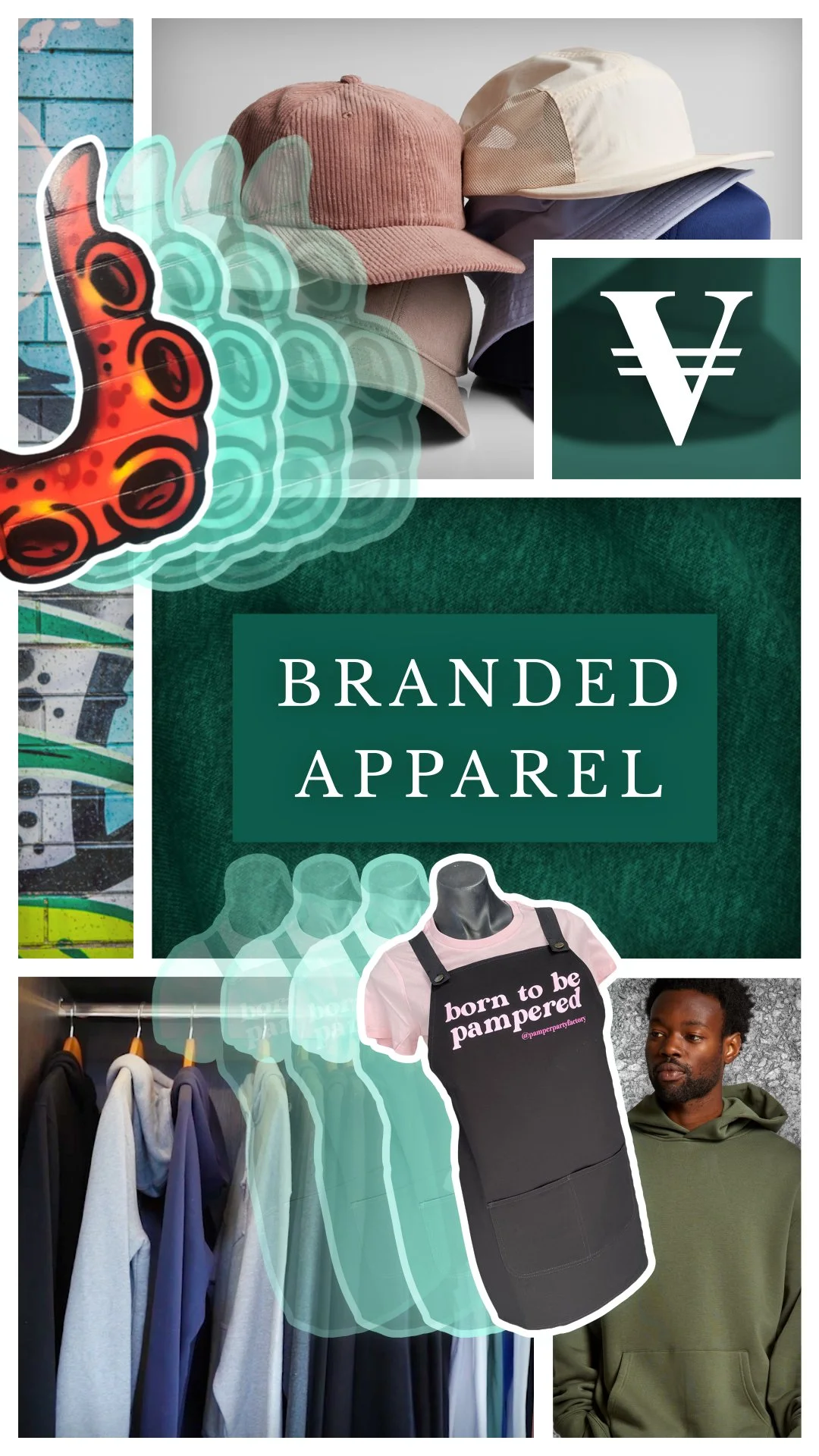
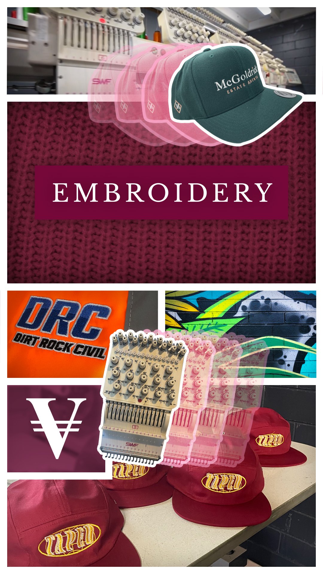
These static artworks each represent their respective Brand Ident Video for that particular service category of the business. They can be used as either a thumbnail for a video of that particular service category or simply a static posts on social media.


Endframe
The purpose of the Endframe is to drive traffic to the website from social platforms and increase the conversion rate from followers to customers. The design and layout of the Endframe is consistent with that of the website, aligning with the theme of the brand ‘Manufacturing Meets Culture’.
‘Hot Tip’ Descriptor Graphic Template
This is an editable, animated template whereby we can easily change the text and the imagery and slip into different pieces of content, kind of like a poster that is designed specifically for a particular brand’s ‘Look & Feel’ and general ‘vibe’. Introducing a sophisticated design and layout into your content allows for effective communication. This is great for an informative frame needing descriptive text graphics that's also dynamic enough with an interesting design layout to retain engagement. For Voyager the this asset was created using their clean, minimal, geometric ‘boxy’ grid to balance text, image and graphic elements.